Not every potential client that reaches out to us has a conversion problem.
Some have an SEO problem, and others have usability issues plaguing their website – and this is something that they might not be aware of at the time.
Of course, these two issues end up negatively affecting conversions.
It’s true. You’ll never boost conversions if your website still has SEO or functionality issues.
Successful Search Engine Optimization and good usability prepare the soil in which a good conversion optimization program is planted.
Fixing SEO and Usability issues is a good starting point. But it still doesn’t guarantee an increase in conversions.
You still have to optimize for conversions – and that’s the hardest part.
If you want to improve conversions on your website, this is what you have to do:
Successful SEO + Usability Optimization + Conversion Optimization = More Conversions
As you may know, SEO helps bring visitors to your site. Usability optimization makes them enjoy using your site because it works well, and it is easy to achieve goals with minimum effort. Conversion rate optimization makes them want to buy from your website and not from anywhere else. One without the other makes it challenging to boost conversions.
What is Usability Optimization
According to Wikipedia:
“Usability is the ease of use and learnability of a human-made object such as a tool or device. In software engineering, usability is the degree to which a software can be used by specified consumers to achieve quantified objectives with effectiveness, efficiency, and satisfaction in a quantified context of use.”
In this context, you can think about usability optimization as the practice of improving user experience by making sure that a website or product corresponds to the following attributes:
- Learnability – How easy is it for first-time users to accomplish basic tasks on your website?
- Efficiency – how quickly can users perform tasks on your website?
- Satisfaction – do users enjoy using your website?
- Utility – does your website has the features that users need?
As you can tell from those attributes, usability optimization is centered around the functionality of a website/product. And the idea here is to avoid making users think about these questions:
- Where am I?
- Where should I begin?
- Where did they put…?
- What are the most essential things on this web page?
- Why did they call it that?
In his book, Don’t make me Think – A Common Sense Approach to Web Usability, Steve Krug says the most important thing to remember when designing a website is:
“Don’t let the users think. Users like mindless choices and omit needless words.”
If your website is not easy to use, easy to learn, efficient, and satisfying to users, they will most definitely leave. Most people assume that their websites are usable just because they can use them – but this might not be the case for a new user who just landed on your website.
One important thing to keep in mind about usability optimization is that it focuses on when users are interacting with your website. The perceptions and reactions they have before, during, and after using your site are what is known as user experience:
So, how do you optimize your website for usability?
Well, the best way to start is to look at your analytics tools to see if there are pages on your site where visitors are dropping off. If you identify those pages, launch heat maps and user recordings, and look at how visitors are interacting with your site on that page.
ALSO READ: Your Complete Guide to Heuristic Evaluation for Conversion Optimization
As you’re waiting for your session recording and heat maps data, you can also do a Heuristic Analysis using Jakob Nielsen’s 10 Heuristic principles:
When done correctly, using the above usability principles, here are some of the benefits associated with carrying out a heuristic evaluation on your website:
- It only focuses on a website’s relevant areas – this means that the problems identified during this session can impact conversions.
- Since it is not a one-person process, there’s no confirmation bias as it encourages a wide range of views and insights.
- The whole process leaves no stone unturned as it assesses the website against clear criteria.
- You can also employ competitive analysis within the heuristic evaluation process.
- You can develop a clear roadmap for the usability optimization steps you need to take after the evaluation.
Difference between Usability Optimization and Conversion Optimization
In a zoomed-out view, usability optimization focuses on improving the web site’s functionality, whereas conversion optimization aims to persuade users to make a purchase, subscribe or download.
But the zoomed-in view looks way different – both usability and conversion optimization have the same end goal: enhancing user experience and to increase conversion rate.
Usability optimization should be a top priority on every web page. You don’t want some elements to behave in ways that visitors do not expect and ruin the user experience, which can lead them away from converting to your site altogether!
ALSO READ: Stop Confusing usability Optimization With Conversion Optimization
This doesn’t mean every one of your pages needs usability testing – sometimes less is more when it comes down to deciding what aspects deserve attention.
On the other hand, not every page has to be optimized for conversions. Not every page on your site has the same conversion impact. Some pages are more important than others. For instance, in eCommerce, you should prioritize pages like category pages, product pages, and cart pages instead of home pages and the about us page.
Another notable difference between usability and conversion optimization is the goals. Usability optimization emphasizes meeting user goals. The idea behind this practice is to make sure that users are completing their mission on a website without any difficulties and with a sense of satisfaction.
The same can’t be said for conversion optimization. With conversion optimization, the focus is on company goals. And those conversion goals have to be aligned with the overall company objectives.
Usability and conversion optimization has the same testing tactics. Usability tests are conducted to measure user behavior, whereas A/B testing (used in conversion optimization) is undertaken to measure user preference. At the end of the day, the results gathered from the tests are used to influence user behavior.
ALSO READ: The 7 Step Roadmap For Effective Usability Testing
Usability improvements are usually performed on the user journey, whereas conversion improvements are specific to pages in the conversion funnel.
Optimization on the user journey involves removing distractions, bugs, and errors that may deflate users from taking the desired action on a website. Conversion funnel optimization involves improving web elements such as the copy, images, videos, CTA buttons, etc.
The difference between usability and conversion optimization strategies is like night and day. The way usability improves user experience is different from how it is done in conversion optimization.
Usability optimization enhances user experience by predicting user behavior. Once you know what visitors want to do on your site, it is possible to come up with clear visitor paths and make your site predictable, easy to understand and navigate.

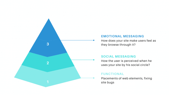
With conversion optimization, user behavior is influenced to push them towards the end goal: conversion. The focus here is on emotional and social messaging to persuade the visitor to turn into a customer. So, everything about your site – images, messaging, copy, etc. – is designed to influence user behavior.
Good Usability Doesn’t Translate to Positive User Experience
Contrary to popular belief, good usability doesn’t always translate to a positive user experience. And fixing usability problems doesn’t always guarantee any conversions.
There were days when you’d use good usability as a competitive advantage. But, nowadays, it is all table stakes. Every customer expects it on every website they visit. One thing we have noticed over the years of working with different clients is:
Most websites do not have usability issues, but their user-experience sucks. This is to say that one website can be easy to use but still have a bad user experience.
Here’s a simple example…
A customer arrives on your website’s product page to purchase a specific product. She manages to add the product to her shopping cart without any problems. And she checks out quickly and easily. This website would score high on a usability scale.
ALSO READ: 6 Website Usability Mistakes that Every Developer Should Avoid
Although the customer made a purchase, she hoped to look at the images of the product taken from different angles and read customer reviews. Without those images and customer reviews, the customer bought the product, but she was having anxieties and concerns about purchasing the product. This website would have a low score on a user experience scale.
So, fixing the usability issues on your website is a must. But do it knowing that it won’t help persuade your visitors to make a conversion. Do it knowing that it will impact user experience to a certain degree.
Customers are not compelled to purchase just because a website is usable. There’s never been a visitor who buys something just because the CTA button works.
Usability optimization makes the ground fertile for user experience and conversion. But it doesn’t guarantee any of those.
After working on your site’s functionality, you still have to work on presenting your offer to improve user satisfaction. You still have to work on your emotional and social messaging on your site to convince visitors to go ahead and convert.
Conclusion: Usability comes first
You already know that you can have good usability and still have bad UX. But you can’t have it the other way round.
That goes on to show how vital usability optimization is. If your website isn’t easy to use and efficient, it will never provide a good user experience.
So, when creating a new website or redesigning a new one, always know that usability should always come first. Suppose you are working on a new website or redesign; before you finish it, test for usability to identify problem areas on your site.


