For a layman, UX and CRO almost seem like the same thing.
After all, they both involve creating the best possible user experience for customers.
Where UX and CRO differ is in their approach to the customer experience and their end goal. CROs want more conversions (howsoever they may be defined in an organization). To do this, they might change the copy, test different designs and rely on analytics data to make decisions.
What exactly do UX designers need to know about CRO? And in what ways can they change their UX practices to accommodate CRO goals?
In this post, I’ll show you 3 things UX designers need to know about CRO, and how to implement them.
To Increase Conversions, Focus on First Impressions
According to research, it only takes 0.1 seconds to form a first impression about a person.
For websites, it’s even less: your users will form an opinion about your site in just 0.05 seconds. Whether they decide to use it or not will largely depend on what they think about your site in these 50 milliseconds.
This first impression depends on a lot of factors: website speed, structure, colors, spacing, scrolling, symmetry, amount of text, fonts, and more.
While you can’t change all of these, there are a few things you can modify to make a stronger impression on first-time visitors.
1. Improve your above the fold area design
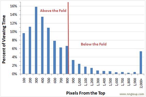
According to data gathered by Chartbeat, 66% of user-time is spent below the fold. ClickTale had similar results – it found that people used scrollbars on 76% of all webpages.
There is, however, a caveat: people dive into content below the fold only if they find the above the fold content compelling enough. And even then, a majority of a user’s time is spent above the fold, as this eye tracking study by Jakob Nielsen shows:
So how can you make the above the fold area more engaging?
Three simple methods work surprisingly well:
A. Use visual cues to encourage interaction
A powerful method to get people to stick around longer is to encourage interaction through visual cues.
Take a look at Airbnb’s homepage as an example:
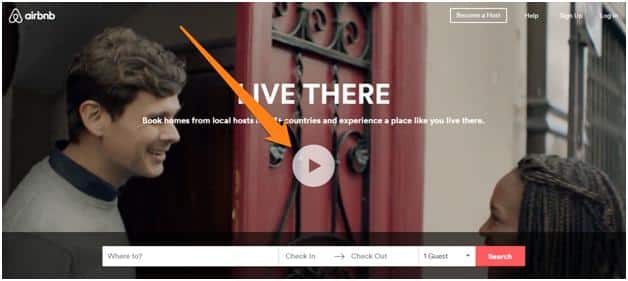
The video ‘play’ button above the fold is an instantly recognizable visual cue that encourages interaction.
Another tactic is to use a visual cue to suggest that there is additional content below the fold. DistanceToMars.com is a great example of this:
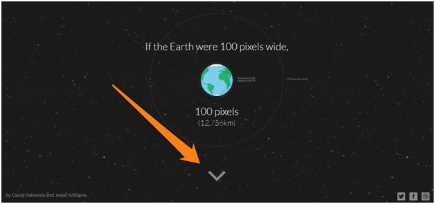
The downward pointing arrow tells visitors that there is more content available if they scroll down the page.
B. Use animation to change page content
Another tactic to get users to stick around is to change the page content through animation.
For example, Ditto, an eyewear subscription company, shows its models with changing eyewear. The changeover itself is highlighted graphically, visually indicating that the page content is changing.
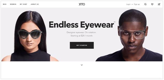
This is a smart way not only to show customers your business model but also keep them interested in what you have to offer.
C. Use alternative navigation styles to encourage scrolling
Another way to scroll is to ditch the standard top nav menu and use visual cues to guide readers down the page.
The Urban Walks website offers a great example. Instead of a top navigation menu, the page uses a menu at the right of the page to guide readers.
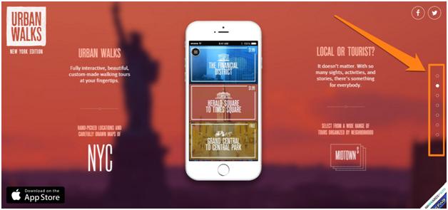
This tells visitors that there is more content further down the page. It also makes moving up/down much easier without any scrolling.
2. Improve your website speed
The speed of your site is crucial to its success.
- According to a survey, 40% of people abandon a website that takes more than 3 seconds to load.
- Amazon calculated that a page load slowdown of just one second could cost them $1.6 billion in sales each year.
- Google also worked out that by slowing its search results by just four tenths of a second they could lose 8 million searches per day.
Simply put, site speed is important. And even though you might think otherwise, it is as much a design issue as it is an engineering issue.
Here are a few things you can do as a designer to improve site speed:
A. Use text instead of images/videos above the fold
Your images are usually the biggest contributor to your page size. If you want more of your visitors to stay, try removing images above the fold and replacing them with text.
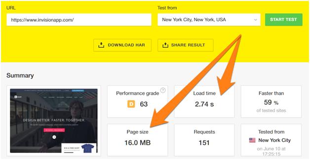
For example, the homepage of InvisionApp has lots of images and a background video above the fold. According to Pingdom, it weighs in at a whopping 16MB and takes nearly 3 seconds to load.
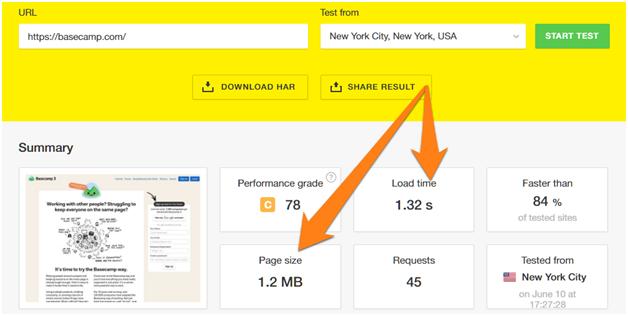
In contrast, the homepage of Basecamp has only a handful of images and lots of text. It loads in just 1.32 seconds and weighs a light 1.2MB:
B. Use CSS icon fonts instead of images
If you’re using icons on your site (and given modern design trends, you most likely are), you can have a measurable impact on your performance by replacing icon images with icon fonts.
How?
Two reasons:
- Icon fonts use vectors while images use raster graphics. The former is smaller in size (in terms of bytes).
- Icon fonts (such as FontAwesome) are included in a single file, which minimizes HTTP requests.
According to PicTonic, you can reduce page load time by 14% by using icon fonts instead of icon images.
Here are two icon fonts you can use in your designs right away:
3. Use familiar design patterns in your layouts
According to Google’s research, users form an initial “gut feeling” about a site in less than 50ms. Whether they stick around or not often depends on this gut feeling.
The key findings from this study were that websites with low “visual complexity and high prototypicality” were perceived as highly appealing.
In simple words, make your web design simple and familiar. If you go for innovative, unconventional layouts, people are less likely to like them.
For example, users are used to seeing ecommerce websites in a particular way. So it is always a good idea to stick to that pattern.
Look how Etsy keeps their homepage as close to other ecommerce website by showing Cart, Register and categories with drop-down menus.
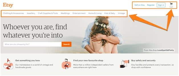
A confused user is less likely to convert (and leads to bad user-experience). Following familiar design patterns can be especially powerful this way.
Embrace Clarity and Ease of Use to Promote Conversions
While you must strive for simplicity in your website design, do not forget ‘ease of use’ and ‘conversion’ are your ultimate end goals.
This is as important for the user-experience as it is for CRO. Whenever possible, strive for clarity and ease of use.
Example? Here are two pop ups:
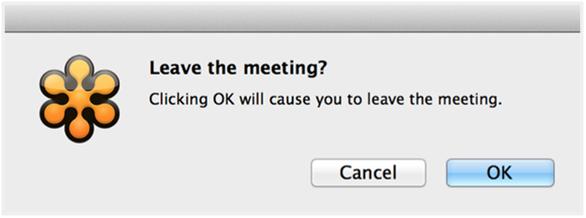
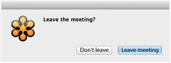
The first option might be shorter and simpler, but the second option is more user-friendly and is less likely to result in erroneous clicks. Making the buttons self-explanatory (though less concise) actually streamlines the whole dialogue.
If you were selling something, the second option will likely get you more sales.
So how can designers apply this rule? Here are a few tactics:
1. Embrace brevity in your design
If you want more people to do something on your site – click a button, buy a product, or even read a blog post – it might be better to remove than to add design elements.
Essentially, you want to say more with fewer words.
MailChimp’s landing page is the perfect example. The entire page is just a single screen with fewer than 100 words.
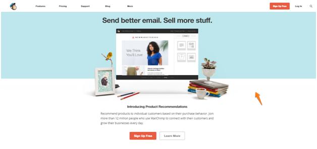
The short, simple message, along with the GIF showing off the product, gets the value proposition across succinctly.
2. Use visual hierarchy to emphasize your message
On any page (as well as in real life), people are drawn to the biggest element first.
This is the basis of all visual hierarchy in design. Use it to your advantage by making your most important message – one which supports your conversion goals – larger in size than others.
Take a look at the Moz.com homepage as an example:
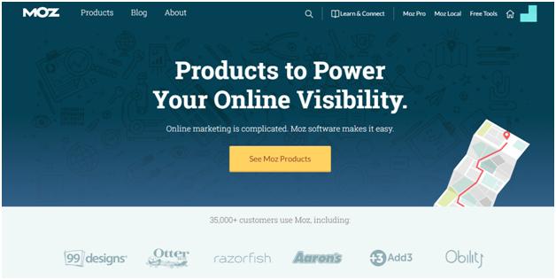
The value proposition – “Products to Power Your Online Visibility” – has the largest font-size, immediately drawing the viewer’s attention.
3. Use typography to support your conversion goals
Typography isn’t just about picking a nice font and using it throughout your design, it goes deeper than that.
Every font has a “personality”, so to speak, and yours should be influenced by your audience.
Some fonts, for example, are seen as “authoritative” or “trustworthy” because of their inherent designs or because of cultural reasons (Helvetica, for instance, is seen as “official” because it is used in government tax forms).
Keep this in mind when picking fonts for your designs. Pick something that resonates with things your audience cares about, or which amplifies the impact of your message.
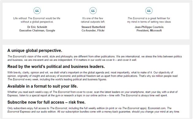
The Economist, for example, prides itself on being objective and modern. A clean sans-serif font works well for its subscription page:
4. Use colors to draw attention to specific areas of a page
Besides branding, colors can also be used to convey visual hierarchy, establish a relationship between elements, and draw the user’s attention.
A good rule of thumb when deciding on colors is that darker colors tend to carry more visual weight. Try to balance these out with lighter colors.
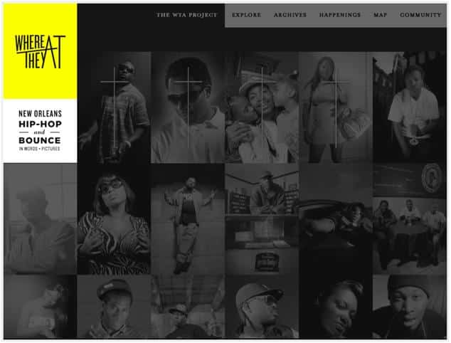
For example, website where they at uses a bold yellow color to emphasize the logo and balance out the dark background:
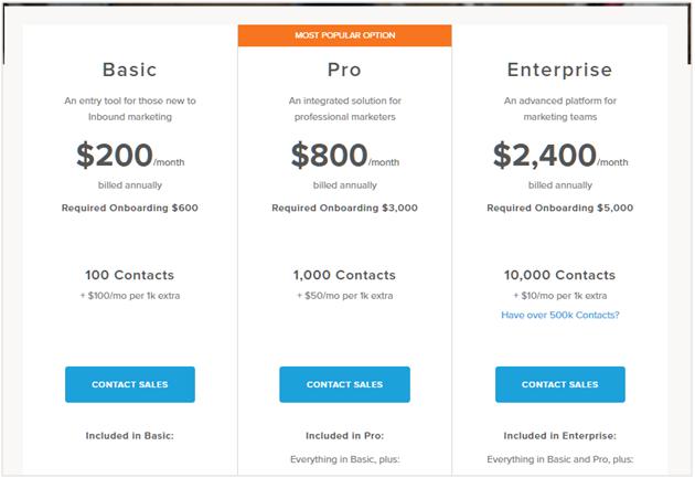
On the HubSpot pricing page, the bright orange of the middle-tier plan immediately grabs the viewer’s attention:
Create Persuasive Designs (without Being Unethical)
We know that improving usability helps greatly to increase the percentage of users trying to reach particular goals.
However, by deliberately impeding user actions, you can get more people to convert, usually at the cost of long-term customer loyalty and trust.
In design, these are “dark patterns”. They might increase conversions but don’t necessarily lead to happier customers or healthier businesses.
An ethical alternative to this is to use the Persuasion, Emotion, Trust Design framework to push users towards your conversion goal.
As per CodeComptuerlove, this framework has four steps:
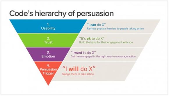
Let’s take a look at this in more detail:
1. Remove physical barriers to perform an action
The first – and the easiest – step in the persuasion process is to make it easy to perform an action.
This means making your buttons and CTAs easy to find and click-on. At no point during any action should users be confused about what steps to take next or the best path to take them.
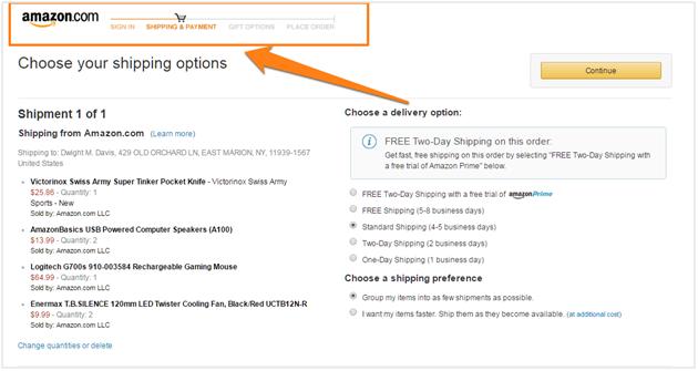
For example, Amazon makes it easy for users to see where they are in the checkout process through visual markers:
2. Build trust to persuade people to take action
Once you’ve made it easy to find and click a CTA, your next step should be to gain your users’ trust and encourage them to take action.
This is a two part process.
The first part is changing your on-page design to build more trust. There are several conversion tactics you can use to do this, such as:
- Adding logos of brands you’ve worked with.
- Adding “trust markers” such as “BBB Accredited Business” badge.
- Adding testimonials from trusted authorities.
The other part of the trust building process is to ensure that users know exactly what will happen when they perform an action.
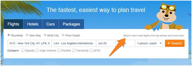
For example, on the HipMunk homepage, the search box clearly identifies that clicking “Search” will show “flights from top airlines and travel sites”:
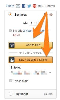
Something as simple as clearly labeling your CTAs can help as well. On Amazon, the two buttons on the product page clearly indicate what action they’ll perform – “Add to Cart” or “Buy Now with 1-Click”:
3. Give users an emotional trigger to perform an action
Trust is great for promoting action, but it doesn’t work quite as well as emotional triggers.
Facebook does this exceptionally well. Its entire user-interface is designed to highlight the actions your friends and family are taking on the site. Since you are obviously emotionally invested in your friends, you’ll probably feel more compelled to follow suit.
For example, on every page, Facebook shows exactly how many of your friends have liked the page as well:
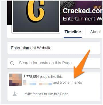
If so many of your friends are performing an action (like a page in this case), there is a chance you’ll be more emotionally invested in following along as well.
4. Nudge users to take action with a persuasion trigger
When you combine all of the above, you can create a powerful persuasion trigger to get users to take action.
Going back to Facebook, one of the most powerful triggers on the site is its notifications icon. This bright red is a powerful visual cue on an all-blue site.
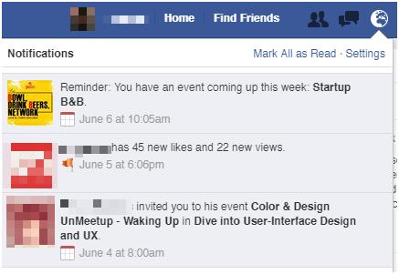
When you click on the notification, you see an exact description of the action that your friends just performed (checked into an event, left a comment, tagged you in a picture, etc.). This builds trust and gives you an emotional trigger to take action.
Finally, when you click on a notification, it takes you to the exact page or section where you can respond, leaving all physical barriers to taking an action.
This is masterful use of persuasion focused design, and it accomplishes all this without confusing the user.
Over to You
As a UX person, your goal is to create a compelling experience for your users without compromising on conversion rates. If you follow the advice above, you’ll not just meet your UX goals, but also get more conversions in the process.
At the same time, don’t assume that the best practices shown above are applicable for everyone. Borrow advice and do your research, but always back it up with testing. You’ll find that testing will often spring up some surprises that change widely-held beliefs.

