Bounce rate is the bane of every marketer.
For one, it is widely misunderstood. A high bounce rate is always assumed to be a bad thing (even when it’s not – especially on landing pages).
Low bounce rates, on the other hand, are equated with engagement even when other metrics (such as time spent on site or actual clicks) don’t back it up.
That said, there are a lot of reasons why you might want to cut down your bounce rate. From increasing search rankings to improving user experience, lower bounce rate is definitely a marketing metric to strive for.
In this post, I’m going to share 7 little known tips on how you can reduce your bounce rate.
1. Find your best performing content and reuse its format and style
Not all pages on your site will have the same bounce rate.
Some pages will simply perform better (in terms of bounce rate) because of their formatting, tone or style.
Finding these pages and reusing their formatting on poorly performing pages can improve their bounce rate. If nothing else, this exercise will show you what kind of content your readers actually like.
To find this content, open your Google Analytics account. Next, go to Behavior -> Site Content -> All Pages.
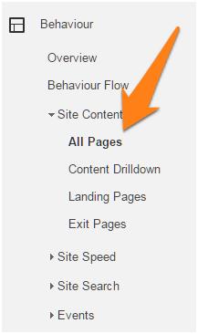
This will show you a list of all the pages on your site along with their page views, average time on site, exit rate and bounce rate.
Sort the results by “Bounce Rate”. Make sure that you sort them in ascending order (i.e. 0% bounce rate to 100% bounce rate):
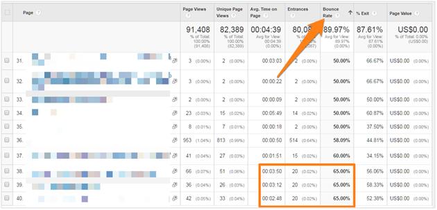
Look for pages that have a good mix of low bounce rate and high average time on page. You might have to dig past a few irrelevant sharing or category pages to find them.
Once you find such pages, open them in separate tabs and make a note of what makes them work.
Ask yourself:
- Is this page using engaging images?
- Does this page have a headline that hooks in readers?
- Is the content format and writing style highly engaging?
- Does the page use a different layout than other pages?
Apply the lessons learned from this exercise to other pages.
2. Update old content with fresh information or a disclaimer
Google has always emphasized freshness in its search results. In fact, there’s an entire component of Google’s algorithm – Query Deserves Freshness – that emphasizes fresh results.
Google focuses on fresh results because it knows its users want up to date information. An article on “SEO tips” from 2011, for instance, will likely have a lot of outdated tips.
This is one reason why Google shows the date the page was last updated in SERPs (when available):
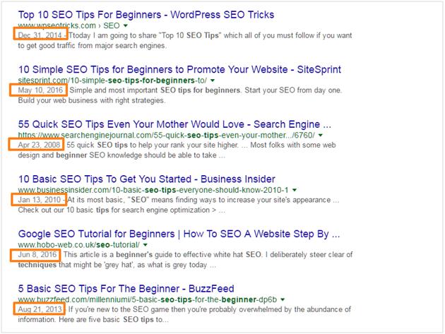
A user landing on a page with outdated information will likely not stick around for long. Hence, poor bounce rate.
There’s an easy way to work around this: find your older content and refresh it with fresh information.
For example, Brian Dean originally wrote this post on actionable SEO techniques back in January 2014.
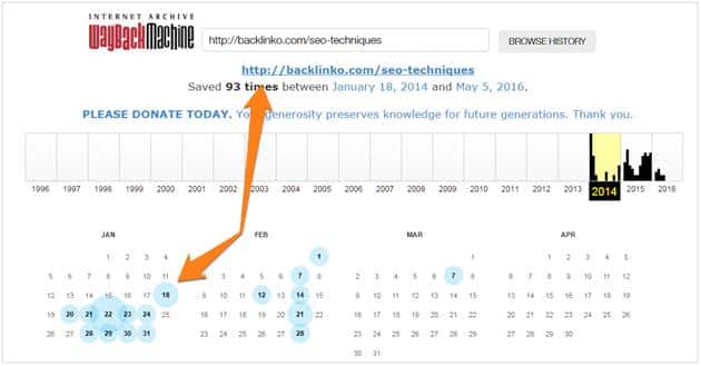
In June this year, he updated this post with fresher, more relevant content. He also changed the post title to reflect this update.
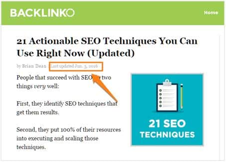
Google’s spiders found this update and changed the SERPs to show the new updated date:
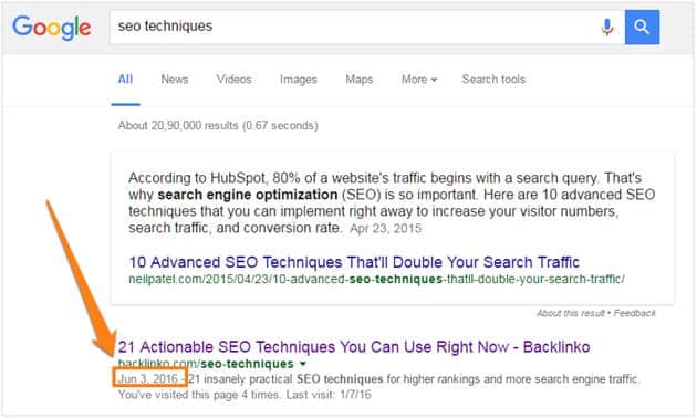
Your updates don’t even have to be elaborate. Simply refreshing key content with newer information can be enough to not just curb your bounce rate, but also give you a ranking boost.
3. Ensure you’re not getting traffic for non-targeted keywords
Not every keyword you rank for will actually be related to your content.
For example, if you Google the keyword “high traffic”, you’ll mostly see results related to marketing.
However, a few results are about managing roads with lots of traffic.
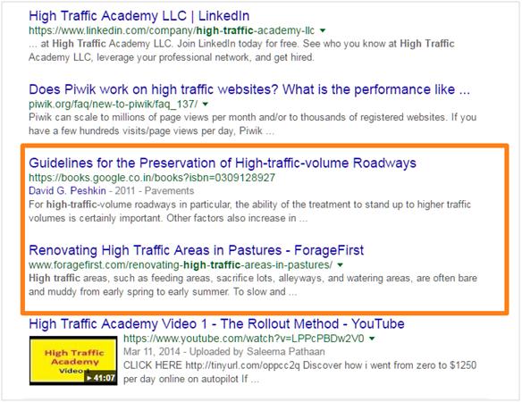
If you were running a site about managing road traffic, there’s a good chance you’ll get some stray traffic from this keyword.
The trouble is, most people searching for this keyword are likely looking for ways to increase traffic to their sites, not understand road traffic management.
These visitors will leave your page very quickly, negatively affecting you bounce rate.
There’s an easy way to find these pages.
First, log into Google Analytics and go Behavior -> Site Content -> All Pages.
Here, find pages with very high bounce rates and significantly lower average time on site (compared to the rest of the site).

Next, log into Google Search Console for your site. Here, go to Search Traffic -> Search Analytics.
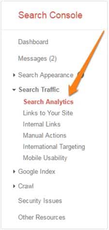
Select “Pages” and “Position” at the top of the page.

Find the page in question with the poor bounce rate. Click this page.

On the next screen, select “Queries” again.
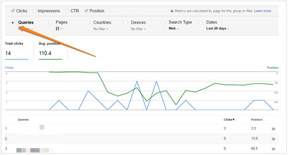
This will show you which queries this page ranks for. If you find a vague query – such as “high traffic” – you can rest assured that your poor bounce rate is caused by the quality of your traffic, not anything on your page.
4. Match user expectation with dominant traffic source
What people expect to find on your site depends on where they’re coming from.
A visitor who clicks on your site link in your Twitter bio, for instance, has very different expectations from someone who searches for a query and finds your site in the SERPs.
Matching your content of a page to the expectations of people coming from its biggest traffic source can do a lot to reduce bounce rate.
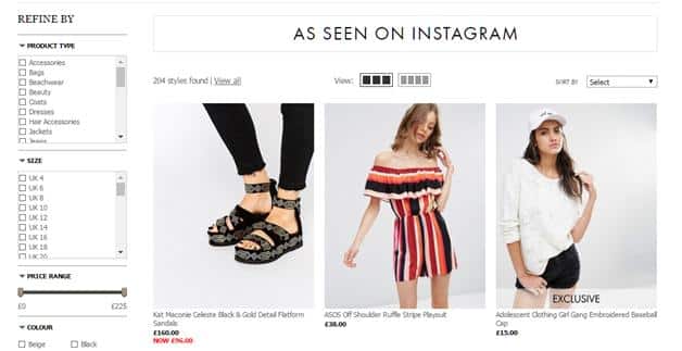
For example, ASOS, the UK-based fashion retailer, shows different landing pages to traffic coming from different social channels.
On Instagram, it leads visitors to a dedicated landing page called “As Seen on Instagram”:
On Facebook, it directs traffic to an “ASOS Likes” blog with Facebook-focused content:
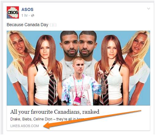
Doing something like this can help you craft an experience tailored for the biggest traffic source for each page.
To do this, log into Google Analytics again and go to Behavior -> Site Content -> All Pages. Now click on “Secondary Dimension” on the “Plot Rows” bar and select Acquisition -> Source/Medium.
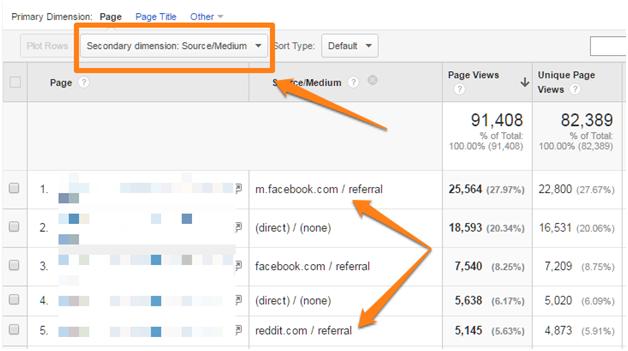
This will show you a list of your pages along with their biggest traffic sources:
In the above example, I can see that the biggest source of traffic to one of my pages is Facebook. For another page, it’s Reddit.
Knowing this, I can create an experience tailored for Facebook or Reddit users.
There are multiple ways you can do this:
- Adding copy at the top of the page acknowledging the visitor’s traffic source.
- Prioritize sharing buttons depending on biggest traffic source. For instance, if you know that a bulk of the traffic to a page is coming from Reddit, you can place Reddit sharing buttons before other social networks.
- Offer additional content (such as downloadables) based on the largest traffic source to the page.
Doing this will ensure that you offer the most optimum experience to the largest share of users to a page and thus, improve bounce rate.
5. Increase pageviews and time on site with content recommendations
A visitor landed on your site, scrolled through the page, and read the entire content.
What next?
By making better use of content recommendations, “read more” and “next article” links, you can increase your pageviews and reduce your bounce rate.
There are several ways to do this:
Show content recommendations at the bottom of each blog post
Once readers have read a blog post, they are much more likely to consume more content. After all, if they liked something well enough to read it, they might very well read more.
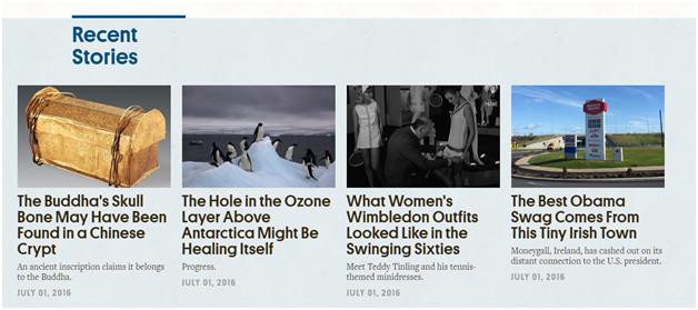
For example, at the bottom of each post on AtlasObscura, you’ll find a list of posts titled “Recent Stories”:
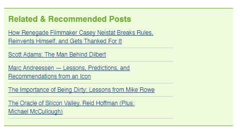
These recommendations don’t have to be necessarily visual. On Tim Ferriss’ blog, he adds a list of recommended posts at the bottom of his content:
On WordPress, you can easily create such recommendation lists with plugins like YARP.
Add a “Random Article” button
If you run a site with a lot of content, your recommendations can be a bit more random.
On Distractify, for example, you’ll see a “Distract Me” button in the navigation bar:

Since Distractify also uses a “sticky” navigation bar (i.e. the navigation scrolls with the page), readers know they can click this button anytime to find more content.
Push visitors to read more by showing them your most popular content
One way to get readers to stick around longer on your site is to show them your most popular content. Since this content is labeled as “popular”, it is likely to get more clicks than a random post (this is social proof in action).
For example, on Tim Ferriss’ blog mentioned above, you’ll see a list of “Most Popular” posts and “Popular Podcasts” in the sidebar:

This is a great way to get readers to read more without negatively affecting their user-experience.
There are other ways you can get people to read more content on your site. NYTimes, for example, has a host of recommendations on its content:
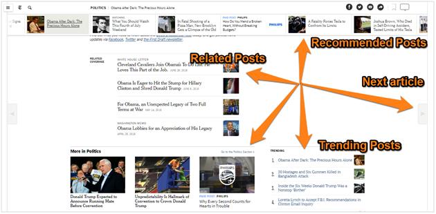
Together, these can push up your pageviews substantially and help cut down bounce rate.
6. Experiment with different layouts
Single column or two-columns? Left sidebar or right sidebar? Sticky or static navigation?
Different layouts will impact your bounce rate differently. A sticky navigation menu might get you more pageviews and clicks, but it might hurt average time per page. A two-column layout might help you get additional clicks/subscribers through sidebar forms, but impact readability, especially on smaller screens.
As with most things marketing, split test different layouts to see what works best for you.
That said, there are some established (and emerging) layout conventions you should follow:
Keep the sidebar to the right
According to usability studies by NNGroup, people don’t read linearly down a page. Instead, they follow a “F-shaped” pattern.
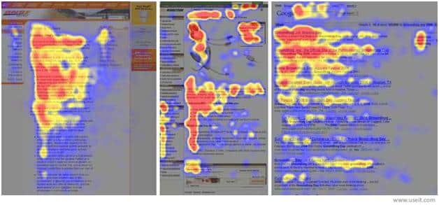
Readers also focus on the largest column of content before going back to smaller columns.
Because of this, the left sidebar is often ignored. The right sidebar, however, gets more attention as shown above.
Lesson: if you must use sidebars, stick them to the right of the page.
For higher engagement, experiment with a single column layout
An emerging layout trend among blogs is to use a large font with a single column layout to promote engagement.
On Medium, for instance, all content is condensed within a 700px wide column.

This helps readers focus on the content and avoid stray clicks and distractions.
Plus, with most readers moving to smaller screens, a single column layout is also easier to read, thus increasing engagement.
Consider adding a sticky navigation menu
Usability experts are seldom advocates of “sticky” menus that scroll with the content, but as far as engagement and bounce rate are concerned, you can’t go wrong with them.
Stick navigation menus ensure that readers always have access to all your content. If they’re done with an article (or don’t enjoy reading it), they can click away to another post.
For businesses, the sticky menu is also a great way to promote your products and services.
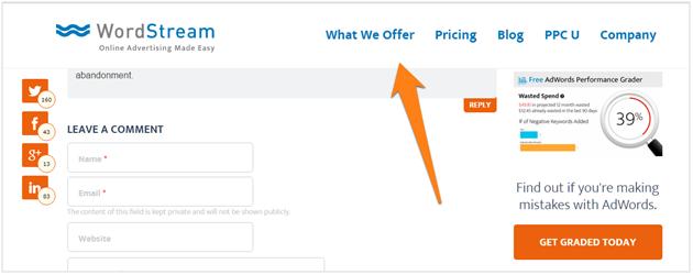
On WordStream’s blog, for example, the sticky menu gives readers a quick way to learn more about WordStream’s product or company:
7. Make sure that your pop-ups don’t hurt engagement
Pop-ups are great for capturing emails, but terrible for engagement and bounce rates.
After all, the last thing your readers want after landing on your site is a pop-up with a hard-to-find “close” button.
Fortunately, there are two ways to make sure that your pop-up doesn’t hurt engagement (while still capturing leads):
Use scroll-triggered or time delayed pop-ups
If a pop-up is the first thing a visitor sees after landing on your site, there’s a good chance he’ll click away.
However, if the pop-up eases into view gradually after he’s scrolled through half the site or spent 15+ seconds on a page, it likely won’t affect the user-experience much.
Plus, since this reader has already had time to read some of your content, he might be more inclined to consider your offer, thus increasing conversion rates.
For example, on BloggingWizard, the pop-up shows only after a 3-5 second delay.

This ensures that the pop-up isn’t the first thing people see on a site.
Nearly any pop-up creation tool will help you create time delayed pop-ups as well. For scroll-triggered pop-ups, try the following plugins:
Use exit-intent pop-ups
Exit-intent pop-ups track a user’s on-page behavior and algorithmically detect the moment when the user is about to leave the page.
By showing users the pop-up only at the exit moment, you get better engagement and conversions.
For example, on Copyhackers, this pop-up shows only when you’re about to leave the site:
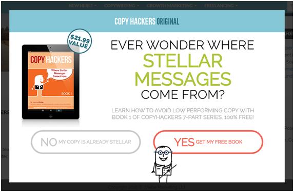
You can try these two plugins for creating exit-intent pop-ups:
Over to You
High bounce rate is a symptom of a problem, not a problem in itself. If visitors are leaving your site without taking any action, it usually means that you aren’t doing enough to keep them interested.
There are dozens of ways you can reduce your bounce rate. Not all of these methods, however, are equally effective.
The tips I shared above go beyond what you usually hear. By analyzing your content, experimenting with layouts, and testing different engagement tactics, you can drastically cut down your bounce rate.

