The landing page is the heart of any conversion-focused marketing campaign.
Yet, they are widely misused and poorly understood.
Should you use a video landing page, a two-step landing page or a click-through landing page? Would an email opt-in landing page work better, or should you go with a microsite?
In this post, I’ll share 4 types of landing pages guaranteed to convert and show you how to use them.
1. The Opt-in Bribe Landing Page
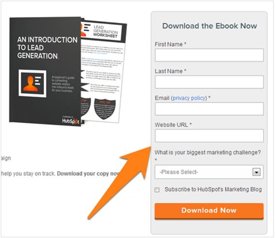
This is one of the most common types of landing pages online: a product image, some copy, and a form. Visitors who land on this page can opt-in to your newsletter in exchange for downloadable content such as an eBook or guide.
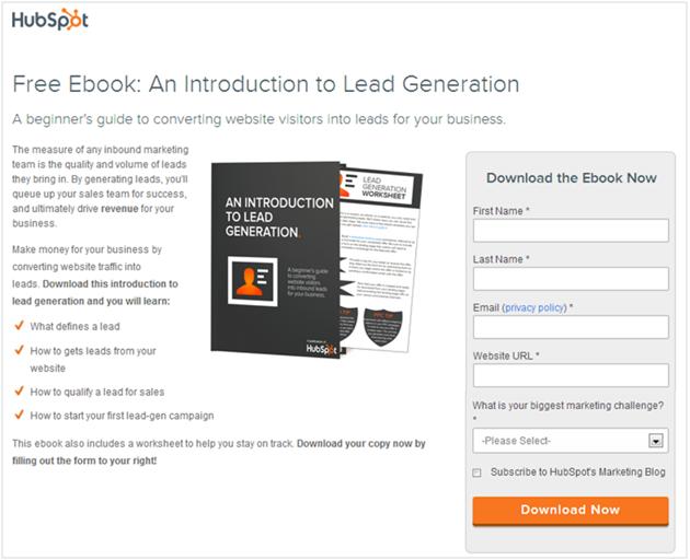
This landing page works due to three reasons:
- Preview image: The product image or graphic visualizes the product and makes it appear more “real”. It also gives you an opportunity to use strong visuals to help the product stand out.
- Headline-focused: The first thing you’ll see on an opt-in bribe landing page is the headline. This is critical for grabbing the reader’s attention and hammering in the value proposition of your product.
- Short form: This landing page usually has a short form with at most 2-3 fields. This is easy to fill and eliminates a lot of friction.
How to use it
There are four key ingredients in an opt-in bribe landing page:
- The headline
- The body copy with a list of benefits
- The product image
- The form
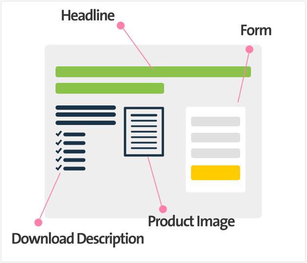
To use this landing page, focus first on the headline. Use strong, emotive and benefits-focused headlines to persuade users.
Next, add your product image. This doesn’t always have to be a product image; you can also add a video, a testimonial or a quote from an authority figure.
Your body copy is important, but not quite as much as the headline. If you’re sending traffic to this page, chances are, you’ve already pitched your downloadable to your audience. Hence, this copy should focus on amplifying the benefits instead of repeating them.
Lastly, add your form. For best results, keep this to as few fields as possible (two is best – Name and Email).
Of course, B2B businesses require more data about their customers. It isn’t unusual for forms in B2B fields to be several fields long.
For example, the HubSpot form above asks several questions from the customer before the download:
How to improve it
While the above four landing page elements are essential, you can improve your conversion rates by adding the following:
- Testimonials from recognized authority figures.
- “As Seen On” logos and badges showing off your digital footprints.
- Two-step download button. This removes the opt-in form and replaces it with a button. Clicking the button takes the visitor to the form.
- A section talking about your company to build trust.
You can also try replacing the product image with a video.
2. The Video Landing Page
There’s a good chance you’ve chanced upon a landing page like this online:
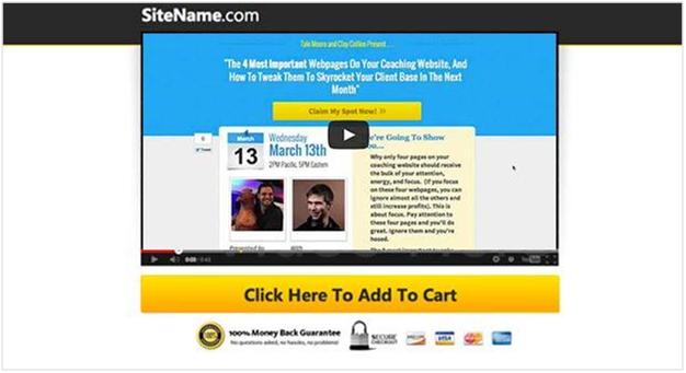
This landing page-type focuses exclusively on the video. Often, this involves removing the play/pause buttons and using a blank background so viewers can focus on the video. Some pages even disable the volume control.
It’s only after a viewer has watched the entire video will the landing page redirect them to a download or sales page.
These video landing pages work because:
- More conversions. Any buttons/forms show up only after the viewer has watched the entire video (or a fixed percentage of it). Viewers who consume so much content are likely to be highly engaged, and thus, convert better.
- No distractions. Landing pages, by design, have minimal distractions. Video landing pages, often, do away with everything save the video, which equals reduces distractions even further.
- More engaging. As a format, video is far more engaging than plain text or even images
How to use it
The video landing page has just two core elements:
- The video
- The form, button or landing page
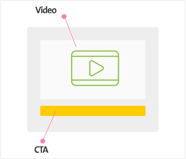
The most important element, of course, is the video. Whitescreen videos work particularly well since they can blend into the white background.
The form shows up either after a viewer has seen the whole video (or at least a large part of it) or is visible from the very start. There is no set best practice, but marketers often redirect visitors to a separate landing page at the end of the video. Here, they can download content, sign-up for a service, or take any action that continues the narrative started in the video.
How to improve it
A few things you can test include:
- Video duration
- Post-video content. Test between pop-ups forms, buttons or redirection to separate landing page.
- Content trigger. Test whether your forms/buttons etc. show up after 30%, 50%, 90% of the video.
3. The Product Landing Page
This landing-page type dominates Hacker News and Product Hunt. In fact, it’s so common that its structure is often the subject of mockery.
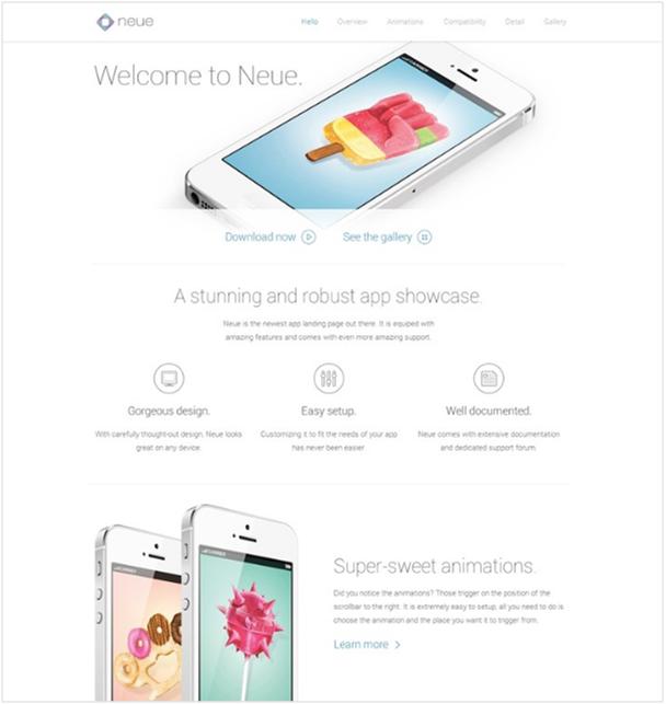
As cliche as it might be, this landing page type works well.
Three reasons why:
- It focuses on features and Readers get a complete idea of what the product is, the problem it solves, and how it works.
- It shows off the product visually. Most product landing pages are highly visual and show off the product’s features and design.
- It uses conversion enables such as social proof, FAQs, etc. One detail common to most product landing pages is the presence of testimonials, user reviews, “featured in” sections, etc. This helps remove doubts and enables higher conversions.
How to use it
The product detail landing page is extremely flexible. Most pages have at least the following features:
- A hero image + strong copy above the fold.
- A list of features and/or benefits.
- Some social proof.
- A pricing/how to buy section.
- An “about” section.
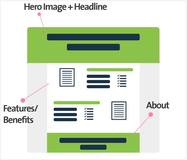
You can mix and match these elements as per your requirements.
How to improve it
The product landing page is extremely flexible. You can throw in or remove elements as you see fit.
For instance, if you’re selling to technically savvy users (such as a cloud computing solution for programmers), you’d focus on the features. For others, you’d focus on the benefits. For SaaS products, a pricing section would be useful, while for more expensive products with longer sales cycles, you can stick to a “call us now” section, and so on.
4. The Long Sales Page
The long sales page has been a staple of marketing since the early days of the internet.
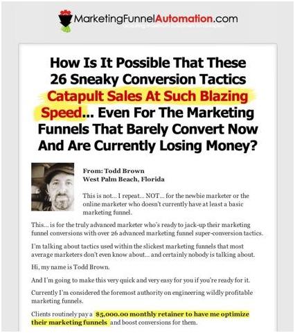
These pages run long – often at 8,000-10,000 words or even longer.
Strangely enough, despite our aversion to reading online, long sales pages convert exceptionally well when done right.
Ramit Sethi’s sales page for Earn1k, for example, was 47 pages long.
These types of sales pages work particularly well for customers in the last stages of the buyer’s journey. Since you’ve already nurtured them, you only need to push for a final commitment by focusing on your product’s value proposition – something these pages do really well.
Why do these pages work?
Here’s why:
- Captures attention. Long sales copy captures attention like nothing else when done right. Good copy is essentially good storytelling, and good storytelling will make someone read even 30 pages. Plus, the format – text with few images – does a great job of keeping out distractions.
- Focuses on value proposition. The best converting long sales pages consistently emphasize the value you’ll get from buying the product. They are less a list of features and mostly a list of benefits.
How to use it
There are essentially three core elements in a long sales page:
- The headline. This is critical for grabbing the reader’s attention after he/she lands on a page.
- The body copy. This is the heart of the page and the part where copywriting skills come into play.
- The call to action button. Usually a large “buy now” button spread throughout the page.
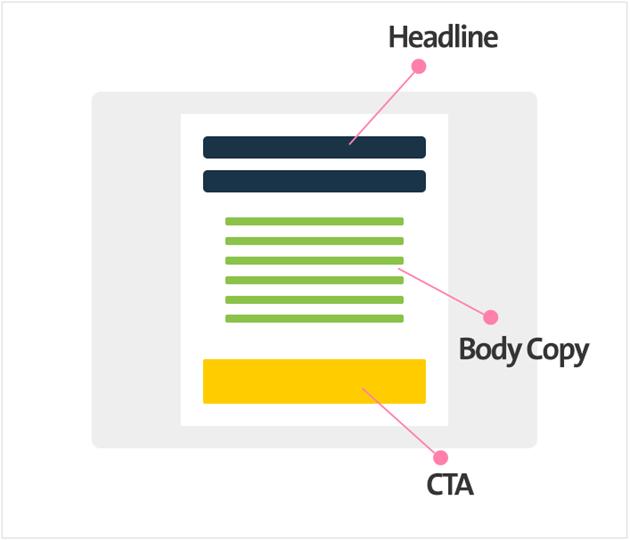
The headline is the first element you need to work on. Something emotive, catchy and visual is highly recommended.
The body copy should focus on storytelling instead of simply listing out the features/benefits. The best performing sales pages get into the mind of the reader and talk to their fears, uncertainties and ambitions.
The CTA is usually a variation of the “big orange button” with a number of visual reassurances of credibility (such as VISA/Mastercard logos), such as this:
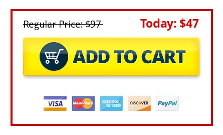
You’ll usually find the CTA at least once at the top of the page, once in the middle, and several times at the bottom of the page.
How to improve it
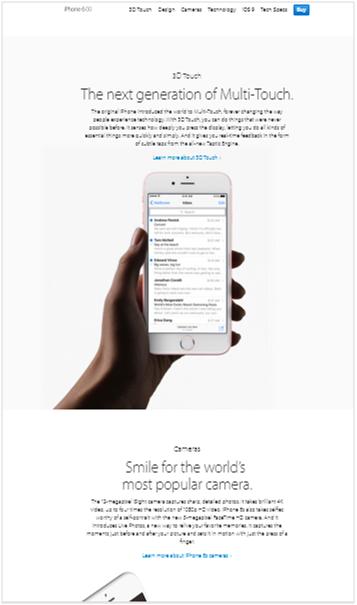
Lengthy sales pages can come across as scammy due to their history of abuse by marketers. One way to stand out from such pages is to use better design.
This way, instead of the standard single-column page, you’d have something that resembles a product landing page, but with a focus on storytelling.
Apple does this exceptionally well:
Over to You
What landing page you use will depend entirely on what you hope to achieve from it, your audience, and their position in the buyer’s journey.
If you want emails, an opt-in bribe page will work great. If you’re marketing to make sales, a lengthy sales page would do the trick much better.
Take your pick of the above four landing pages, grab some landing page templates from your favorite landing page provider, and add your content. As always, make sure to test your pages for the best results.

