Disclaimer: This section is a TL;DR of the main article, and it’s for you if you’re not interested in reading the whole article. On the other hand, if you want to read the full blog, just scroll down, and you’ll see the introduction.
- Conducting a usability test or user testing is by no means cut and dry. Many methodological pitfalls can turn the whole test into a flop if not conducted properly.
- Over the past years, usability studies have undergone some tremendous changes. They are now more sophisticated yet easier to run, offering more actionable insights and better results to improve user experience.
- Keep in mind that every usability test is different in terms of its goals and requirements. However, these tests share common elements and can follow the overall roadmap.
- Define Your Goals: this is the most crucial part of the process. You should have a clear result for the study and decide whether you want to gather (qualitative or quantitative insights or address issues related to the design of your system.)
- The more focused your tests are, the more accurate and relevant the results will be. Conversely, the more questions you commit to, the more room there is for errors and misinterpretations.
- The second step is determining and recruiting users: The most significant and valuable insights derive from real users. The users included in a usability test must closely match your website visitors and your target market.
- Decide on the number of participants you need to recruit and how many you can afford within your budget. The number of participants can drastically affect the results of your test.
- The third step is to choose the format of your test: There’s the in-person usability test method and remote usability testing.
- The in-person usability test method has 3 types (the silent observer or natural, think out loud method, and the constrictive interaction method).
- Remote usability testing has 2 types; moderated and unmoderated usability tests.
- The fourth step is to define the tasks within the test. Almost everything you present to them during the test impacts your users’ responses and reactions, so you have to be careful not to create biased tasks for your participants to complete.
- Tasks may be either open/exploratory or closed/specific, and finding a middle ground between these two extremes would provide a healthy mixture for users.
Characteristics Of Good Usability Tasks
- Propose a task, not a question: avoid making the task look like a question rather than an actionable task that users are supposed to do.
- Be specific: Specificity is an essential component of your tasks. Do not leave users with questions in mind, wondering what they are supposed to do and what the next step is.
- Avoid instructions: Going to the other extreme and start giving instructions and indications to users to get the test right is another mistake.
- Give participants space: The core of testing a system’s usability relies on giving the users space and providing similar conditions to the real use of the system. You can assess participants’ frustration, struggle, and relief within similar conditions.
- The fifth step in the usability testing roadmap is to build questionnaires.
- There are 2 types of questionnaires, the first being the pretest questionnaire. This helps you to understand your users better. The second is the post-test questionnaire. these questions will also help you understand the experience that the participants went through as they completed the tasks.
- The sixth step is to try a dry run. This means running a pilot test will help you estimate the time necessary to complete the actual test.
- The seventh and final step is to report the findings. There is no specific or single method to analyze your data. You can choose and agree with your team on whatever method works for you. For example, you can summarize the difficulties encountered by each user and then gather the common ones.
Here’s A Longer And More Detailed Version Of The Article
How often do you conduct a usability test to realize middle-way through you should have taken a different route?
I wouldn’t be surprised if the answer was very often!
Conducting a usability test is by no means cut and dry, and there are many methodological pitfalls that can turn the whole test into a flop if not conducted properly. It is also an important step when conducting a conversion optimization project.
With the different kinds of usability testing, you should keep an eye on the issues that may rise along the way.
This article will focus on answering questions such as:
- How do I get started with usability testing?
- What are the steps I need to follow to obtain valid results?
- How do I make sure not to miss anything?
- What are some of the pitfalls that I need to avoid?
- How do ensure that I will collect valid and significant results?
Over the past years, usability studies have undergone some tremendous changes. They are now more sophisticated yet easier to run, offering more actionable insights and better results to improve user experience.
Before diving into the know-hows, keep in mind that every usability test is different in terms of their goals and their requirements. However, these tests do share common elements and can follow the same overall roadmap.
Let’s begin with the planning phase.
1. Define Your Goals
Defining the goals of your study is probably the most crucial part of the process.
You should have a clear result for the study and decide whether you want to gather:
- Qualitative, or
- quantitative data, or
- address issues related to the design of your system.
Having a clearly defined goal limitation is key.
The more focused your tests are, the more accurate and relevant the results will be. On the flip side, the more questions you commit to, the more room there is for errors and misinterpretations.
The scope of your test could be broad and addresses general questions such as:
- Which navigation page works best and provides a more user-friendly experience?
- How users are currently using my app?
Or even more specific questions, such as:
- What exactly is stopping users from proceeding to checkout?
- Which element on checkout attracts users’ attention the most?
2. Determine and Recruit Users
The greatest and most useful insights derive from real users. Make sure you know your users well, so you can recruit the right participants.
The users to be included in a usability test must match closely your website visitors and your target market. There are instances where website visitors do not match your target market. In most cases, recruiting website visitors for a usability test (when possible) is the best option.
To get representative participants, you must know who the users of a current system are, or who the targeted users of a newly developing system will be. Only participants who truly represent the actual users can provide the kind of valid feedback you need to make meaningful improvements to a design.
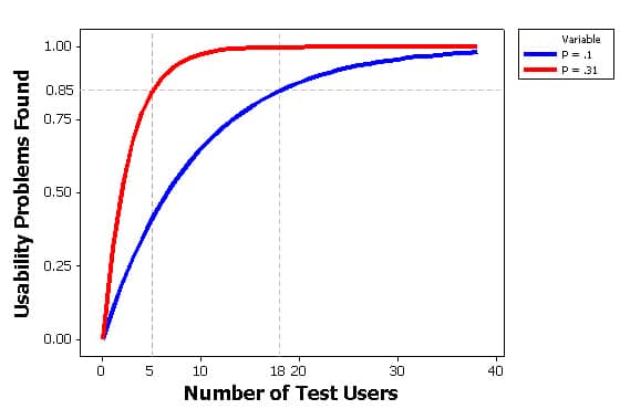
Image source: measuringu
Decide on the number of participants you need to recruit and how many you can afford within your budget. The number of participants can affect drastically the results of your test.
We typically like to limit the number of users within a usability test to anywhere from 3 to 8 users. Some companies recommend conducting larger scale usability tests including 50 to 150 users.
Years of experience have shown us that there is marginal benefit from adding more users.
3. Choose the Format of Your Test
There are different formats for conducting the usability test.
In-Person Usability Testing
The Silent Observer or Natural: the observer stands silently behind the users and doesn’t interact with them in any sort of way to be able to analyze their behavior in their own environment.
Think Out Loud Method: this method might be uncomfortable for users since they describe everything they do or think of out loud, but it is extremely insightful and useful for the experimenters. The think out loud method allows you as an experimenter to have a clear vision about what’s going on inside the users’ mind as every part of their thought process is articulated.

Constrictive Interaction Method: using this method you can either have two users working together and helping each other completing the task, or you can ask questions and offer suggestions to them without helping them or guiding them to complete the task. This method allows interaction between the users and the experimenters and you can see how they work through the hurdles they face during the test.
Remote Usability Testing
Remote usability testing can be an alternative for in person testing as it is time and cost effective and the users can complete tasks in their natural environment.
Moderated: these sessions allow the interaction between the observer and the test user. It is somehow similar to in-person testing as both the moderator and the participant are online simultaneously.
Unmoderated: these testing sessions are completed by the participants independently behind their screens, without an interaction with the test moderator, and there is no opportunity for the experimenters to ask questions or have any sort of involvement during the task even if needed.
Editor’s Note: We highly recommend in-person usability testing as they allow you to read the users’ body language and be in contact with them in real life rather than trying to infer their movements and watch them remotely.
4. Define the Tasks Within the Test
Your users’ responses and reactions are impacted by almost everything you present to them during the test, so you have to be careful not to create biased tasks for your participants to complete.
Tasks may either open/exploratory or closed/specific, and finding a middle ground between these two extremes would provide a healthy mixture for users. You can suggest scenarios for the participants, or direct provide the tasks for them to take.
Open/Exploratory Tasks: tend to be more broad, research-oriented. In this case, you provide participants with the minimal amount of information on how to perform the task.
These kind of tasks may have more than one answer as the answers vary from one users to another.
Closed/Specific Tasks: are more focused and goal-oriented. As they have an end point, they limit the scope of interpretation and confusion for the users and produce more adequate and accurate results.
Characteristics of Good Usability Tasks
When building tasks, follow these guidelines to create meaningful results:
Propose a task not a question
Avoid making the task look like a question rather than an actionable task that users are supposed to do.
A good task is NOT a question which participants are supposed to answer. A bad task is asking participants direct questions with predictable answers.
Make sure to choose the most meaningful tasks within your system, according to the goal you set for the test.
Be specific
Specificity is an essential component of your tasks. Do not leave users with questions in mind, wondering what they are supposed to do and what he next step is.
A good task is neither vague nor tiny, you want to make sure that you are not focusing on tiny and miner features and make main goals in your task and should cover and highlight only the important features of your system.

Avoid instructions
Going to the other extreme and start giving instructions and indications to users to get the test right is another mistake.
By doing so, you ruin your test. Instead of receiving accurate and real results, you will obtain the results you want. Biased results will not help you in assessing your system usability.
Give participants space
The core of testing a system usability relies on giving the users space and providing similar conditions to the real use of the system. Within similar conditions, you can assess participants’ frustration, struggle, and relief.
Editor note: a best practice we follow is to create the steps within a test and then conduct one remote usability test using these tasks. That will help us uncover any problems in the design of our tasks. It also allows us to refine our process.
5. Build Questionnaires

You can use two main types of questionnaire in usability tests.
Pre-test questionnaires: these questions help you understand your users better. With 7 to 10 questions on relevant background information, as users’ age, gender, educational background, beliefs, and their experience with the system (whether a novice or an expert), you can collect important data to evaluate how a target audience engages with your product. Keep in mind that these questions should have a direct relationship to your users, the functionality of the tasks chose, and the goal you set for your test.
Here is an example of the kind of questions you might ask in the pre-test questionnaires:
How often do you shop online? (i.e. Amazon, EBay)
- Never
- I shopped once or twice last year
- I shop approximately 3 to 7 times per year
- I shop regularly (How often?) ________
Post-test questionnaires: these questions will also help you understand the experience which the participants went through as they completed the tasks. You can ask participants to give their feedback on how easy or difficult it was to use the system, and how much they enjoyed or disapproved the experience. Keep in mind that you should give your users space to judge the usability of your system.
A good example would be the following question:
How did you find the application?
- Easy to use
- Hard to use
Can you explain why? ______________
6. Try a Dry Run

Rehearsing for the study is crucial to make sure that everything is ready and to avoid any kind of complications during the real test.
Running a pilot test will help you estimate the time necessary to complete the real test. You can make a schedule for each task, in case of many, and prioritize them in accordance to their importance and relevance to the main goal of the study.
Through conducting a pilot test, you assure that the real test will run smoothly, without problems or major surprises. The dry run is also an opportunity to test if the tasks are clear to the participants.
We often run a pilot test with our team members. One or two pilot users are more than enough to detect severe problems and prepare ourselves for the real test.
These tests usually give us different perspectives on how users engage with a website. Just because it is a pilot test, it doesn’t mean you need to dismiss any findings. If everything goes well, the pilot test can also provide meaningful data to your study. Pilot tests can reveal interesting, unexpected findings on dry runs.
Editor note: When conducting an internal pilot test, make sure to include users who are not familiar with the system you are testing.
7. Report the Findings
If all goes well, after you finish your usability test, it’s time to gather and compare your findings.
There is no specific or single method to analyze your data. You can choose and agree with your team on whatever method works for you. For example, you can summarize the difficulties encountered by each user and then gather the common ones.
You can also classify these problems, if any, and rate them in accordance with their severity or importance, to determine which ones to address first and which to drop out of your list.
Based on the findings, you’ll be able to spot problem areas within the system and create solutions that will make it more useful.
Case Study: The Usability Test in Action

To illustrate the steps above, let’s take a look at the usability test we conducted for large e-tailer that provides digital photo finishing solutions and customized photo products.
Goal: The main focus of the study was to find answers for the following design questions and make informed changes while redesigning particular sections on the website.
- how easy it is to locate a particular photo product?
- how easy it is to customize it and add to cart?
The users: The study was conducted with 6 users. After completing the tasks, they were asked to answer follow-up questions.
The format: Users were using Chrome browsers because the application only supports that, and they were required to speak throughout their experiences as we have chosen the think out loud method in this test.
The scenarios and tasks: You would like to create a customized baby photo gift. You have different photos that you think will be lovely for some kind of wall decor in your bedroom.
Task 1: Find a customizable a wall decor photo you like and can imagine in the bedroom.
Task 2: Create 3 different customization options for your photo.
Task 3: Add the 3 different customized items to your cart.
Task 4: Create an invitation for a baby meet and greet using 2 of the customization you just created.
Task 5: Complete your purchase
Questionnaire and findings
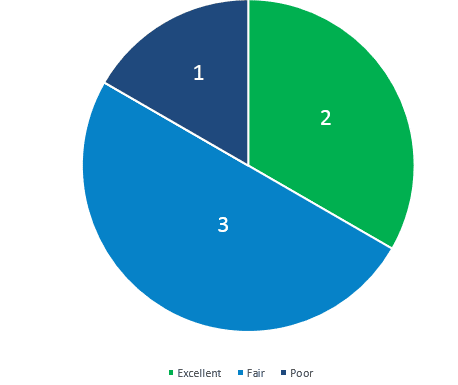
Question 1: “How would you rate your overall experience on this site?”
- 5 users rated the experience as fair and excellent.
- Only 1 user rated the experience as poor.
Question 2: What would you say is the most frustrating aspect on the website?
Main Comments of the participants:
- Builder functionality problems
- There were several website glitches
- Slowness of the builder
Question 3 : What would you say is the most frustrating aspect on the photo builder?
Main Comments of the participants:
- Navigating the builder
- No guidance or informative indicator about process
- Users could not find CTAs
Question 4: What is the first thing we should improve on the site?
Main Comments of the participants:
- Improve or change the builder
- Highlight next steps
- Add more design and filter options to the builder
This testing revealed problems in the following areas:
- Builder functionality
- Builder “Add to Cart” and “Save Project” CTAs
- Unclear user flow
- Overlooked functionalities
Over to You
Preparation is key when it comes to the validity and significance of usability studies. Defining the scope of the test and what you are trying to accomplish to start with.
Note that words are powerful and it takes only one wrong word to change the whole task conception and only a good one to correct it. Hence, it’s fundamental to be careful and avoid bias when creating your tasks.
It’s highly advisable to conduct a pilot test before having any test users take the real one.
Be open minded and get ready to be surprised, because at this stage you can come across findings that you never guessed or thought about.


