There is high growth seen in mobile shopping last few years. According to eMarketer research, there is an 81% increase in mobile commerce in 2012; which constitutes a $25 billion market.
mobiThinking research shows that users prefer mobile website, for shopping, to know about product prices, reading reviews about the product, and buying the product. I have written an article earlier about Responsive Ecommerce Design to Generate More Conversions from where you can get idea on how to create a mobile website.
In today’s article I will focus on mobile checkout UI/UX tips to generate more conversion and better user experience.
Leverage Mobile UI Elements
While designing the mobile website we should have keep in mind the screen size and we should accommodate the content and objects accordingly.
Most of the big ecommerce sites have their presence on mobile commerce. The below example shows how a company created a responsive cart page experience.
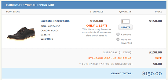
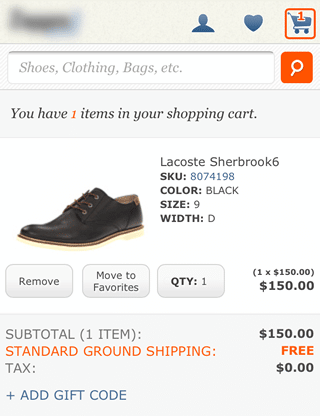
In the above cart page example, the web version has typical links “remove” and “move to favorites” to function accordingly. But if you compare it with their mobile site version you would notice that they have placed buttons instead of the typical link to give leverage to the touch screen user experience. Also the “QTY” button work as a select box.
Use Geolocation
One of the great features on mobile devices is accessibility of Geolocation. You can detect user location to locate the store, shipping price and to estimate the shipping date and time. Best Buy got 28% of visitors visiting mobile website were using it to make in-store purchase.
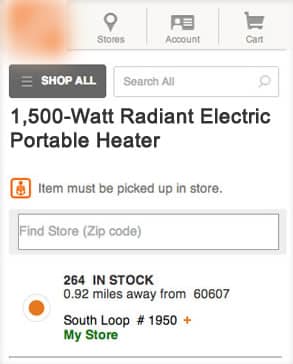
On home repair websites, you can pick the items up and can select the store to pick up as and they use GPS to find the closest sore to you.
One-Tap Calling:
Think when you are on your way and searching a number to get more information about something and you do not have pen paper. You searched the number and can’t memorize it and how would you make call? One-Tap calling allow users to call on mobile devices.

See the example above where there is a customer care number and you can click on that number and make a call instead or memorizing and note down the number somewhere.
Optimize UI Flows, Element and Build Lightweight
Nobody likes to wait. (Google sets “Every millisecond counts” as the second principle of its user experience.) Optimizing every individual screens, flows and UI elements will reduce waiting times and keep users from thinking that they’re wasting their time.
You can see what slowing down your page by using different tools available. One of the most popular is YSlow.
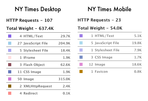
Image from coludfour
You can compare web and mobile web elements optimization. Desktop site consist of 637.4K and on the other hand mobile site consist of only 54K. This means that we cannot add so many elements such as graphics, links, etc.; all of which add weight, and in turn slow mobile connections that make users wait longer and abandon the site. 74% of mobile visitors will leave a website if it takes longer than five seconds to load.
People are shopping at faster rates and are less patient, so take these few steps to make their mcommerce experience result in more conversions for you!

