How many of you treat emails as your products?
I’m guessing, a few…
Just like the product you sell, welcome emails have to satisfy the customer’s needs or wants.
Your new subscribers have to see value in the first email you send them from the word go.
That’s how you get them hooked.
Considering that 57.7% of marketers already send out welcome emails too, what can you do to make yours stand out from the noise?
That’s where Jobs to be Done (JTBD) comes in.
Using the JTBD framework to write your welcome email is an exciting and rewarding process that can help you tailor the content and images in a way that fulfills the subscriber’s needs.
The basics?
A welcome email is the first impression a company makes with a new customer, blog subscriber, or newsletter subscriber via email.
Welcome emails can deliver videos, special offers, a sign-up form, or just a friendly hello to establish a relationship with a new contact.
Don’t think welcome emails are important?
Think again.
To show you how important welcome emails are, we conducted research and found out this:
- The average open rate for a welcome email is 50%. That makes it 86% more effective than standard newsletters.
- 76% of people expect to receive a welcome email immediately after subscribing to your list.
- Users who receive a welcome email show 33% more engagement with the brand.
- Welcome emails on average generate up to 320% more revenue per email basis than other promotional emails
- The conversion rate is 0.94% for welcome emails (4.01% for real-time messages) compared to 0.10% for a typical email
The welcome email you send sets the foundation for the rest of your communications with a new customer.
But how can JTBD influence the contents or even down the road the strategy of welcome emails and beyond?
That’s a good question.
By way of a brief introduction, the #JTBD framework came out of Harvard Business School, and it has helped many marketers understand:
- When customers prefer to buy or hire your products or services (ie what is happening in their lives when they decide to hire your product or service)
- What progress are they trying to make with your product or service
- Who or what they fired before settling for your product or service
- What habits or anxieties delayed the decision to hire your product or service
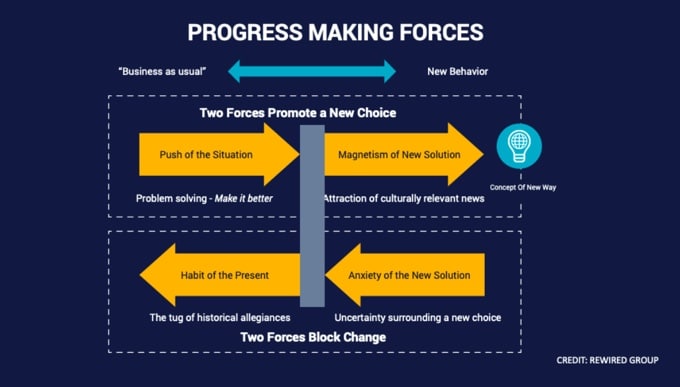
This level of detail is essential in understanding the social and emotional needs that drive customers to consider purchasing from any given site.
Attaining such a level of detail is not easy. Email marketers will have to interview customers in a particular way that uncovers customers’ struggling moments.
It’s not all about asking why questions during the interviews. But it’s about taking it as if you are filming a documentary about your customer as they struggle with a situation that can be solved by your product.
Once you have completed a series of JTBD interviews and figured out the underlying motivation that led customers to your store, you can begin to tailor your email content and images to fulfilling that job/desire.
And, in the process, the end goal of your welcome emails should be about leading customers back to the site and bringing in more revenue to your eCommerce store.
How can JTBD help with customizing welcome emails?
Customers and prospects sign up to your eCommerce site because they are trying to make progress against their current situation.
The first email you send to them should let them know WHY your site will help them make “progress” – and that happens through understanding what progress they need to make and why other solutions don’t offer that.
Having said that, I signed up for the email list of several eCommerce websites and I picked out eight welcome emails that I will explain the dos and don’ts from a JTBD perspective.
Disclaimer: some examples I highlight in this section might work great for your business, and others might not.
We recommend that you test to see which one will work best for you.
Do: Talk about your mission as it will resonate with your visitor
Welcome email example: ModCloth.
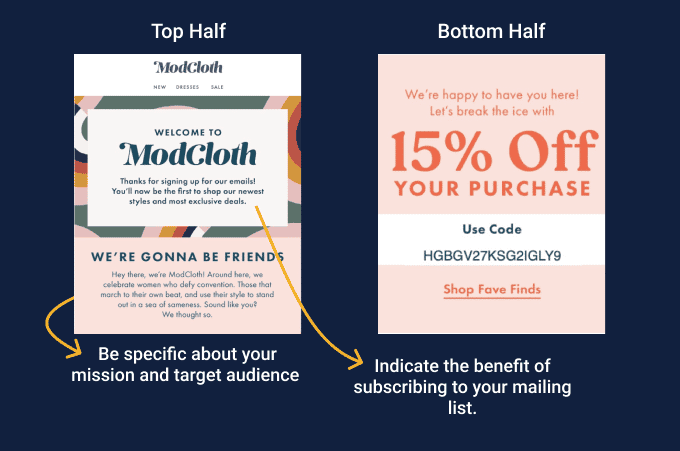
Here’s what the Modcloth welcome email currently looks like:
What could be the #JTBD statement for Modcloth’s welcome emails?
When a prospect signs up for our mailing list, we want them to know (1) the benefit of signing up, (2) the targeted audience for our product, (3) and we want them to make a purchase immediately.
The interesting thing about Modcloth’s email is the use of a specific language that indicates a specific targeted audience: “we celebrate women who defy convention. Those that beat to their own beat.”
From a #JTBD perspective, this is definitely a do. I mean, you can tell that they’re solving a problem for these women by offering them products that are statement pieces and help them stick out from the crowd embracing their individuality.
The value of subscribing to Modcloth’s email list is made clear: “You’ll now be the first to shop our newest styles and most exclusive deals.”
Like most welcome emails, as you will see below, Modcloth offers a percentage discount to lure customers into making a purchase immediately.
Don’t: Create a cookie-cutter welcome email that doesn’t inspire prospects to make a purchase
Welcome email example: Allbirds
As mentioned earlier, great welcome emails are tailored to address customers’ struggling moments.
But when you see Allbirds’ welcome email, you’ll agree with me that they have a terrible way of welcoming new potential customers. Take a look at their welcome email:
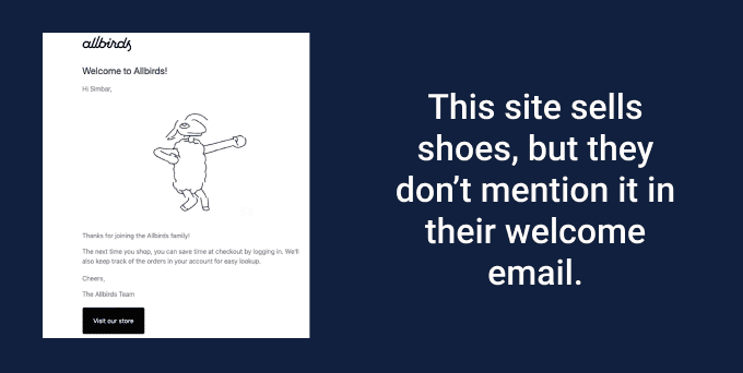
This site sells shoes, yet even from their welcome email, you will need to look up what they do.
Allbirds’ welcome email doesn’t help you make progress against your struggling moment and the email doesn’t even show you how their products would assist resolving your current struggling moment.
Looking at Allbirds’ welcome email, one would assume that there was no research done to understand what sparked the customers’ initial interest in Allbirds’ product.
Don’t: Emphasize features over the emotional and social motivations
Welcome email example: Away
Unlike the Allbirds’ welcome emails, Away takes a different approach to their welcome email concept. This is how their welcome email currently looks like:
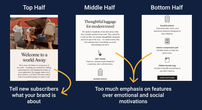
Looking at Away’s above welcome email from the JTBD perspective, one would assume that their target audience’s struggling moment(s) is when traveling with luggage.
What is the #JTBD statement for Away’s welcome emails?
When prospects sign up for the mailing list, we want them to know what the Away brand is about, what they can benefit from using our product, and what makes our products different.
Looking at the Away’s #JTBD statement, you can tell that there are three jobs that this welcome email (as a product) has to fulfill.
Now, how does Away address the above jobs in their welcome emails?
Job # 1 – Tell new subscribers what the Away brand is about: “We believe in seeing more of the world –in making new connections, shifting your perspective, and changing the scenery at every opportunity.”
Job # 2 – What will new subscribers benefit from using our product: “Our luggage makes travel more seamless...”
Job # 3 – What makes our products different from alternatives: “It’s simple, thoughtfully designed, and never gets in the way.” To further reinforce this point, the email also includes the features of the product: “360º wheels, durable exterior, Interior compression pad, and hidden laundry bag.”
What I’d consider as a downside of this email is that it is feature-focused. Three-quarters of it is focused on the characteristics of the product: its appearance, components, and capabilities.
By being feature-based, Away missed a chance of connecting with their new subscribers emotionally. This would have helped them increase sales because emotions are the main drivers in the entire decision-making process.
To reflect the emotions in their welcome emails Away should have highlighted the feeling that customers want to have or avoid after having purchased their suitcases.
Don’t: Drive your new subscribers away from your site
The welcome email I got from Lush is also a good example of an email that doesn’t talk about the job of the product, instead, the email comes with its jobs to be done.
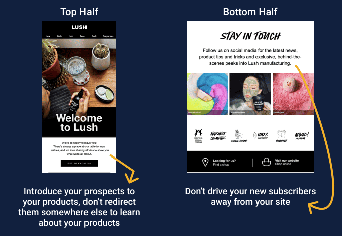
This is how their welcome email currently looks like:
The main task of a welcome email is to connect with new customers and encourage them to interact with your product or service in a way that increases customer retention.
I like how Lush’s email design mirrors the style of their copy in terms of color and font sizes. But their email conversion strategy seems to be problematic.
The email was supposed to introduce new customers to Lush’s brand products, not to have a CTA button (GET TO KNOW US) that redirects them somewhere else to learn about the brand’s products. I mean, isn’t that the whole purpose of a welcome email?
Another mistake they make is to drive new subscribers away from their site. Notice how Lush’s welcome email drives the new customers to the company’s social media platforms instead of their website.
Yes, you want new subscribers to follow your brand on social media but that’s not something you should give first preference to. Instead of inviting customers to your social media platforms, why not talk about your brand story –at least that is something that can help your customers buy your products.
Don’t: Make it just about offers and incentives
Welcome email example: Starbucks
The reason why I had to add Starbucks’ welcome email in this list is that their email is missing one element we have seen from other welcome emails.
Before I name it, can you guess what it is?
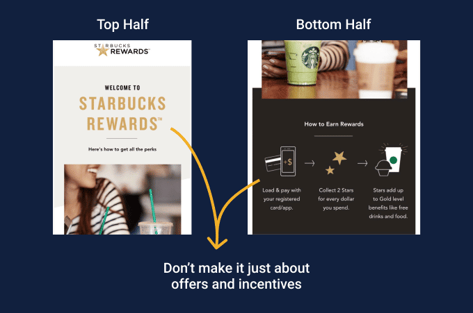
If you take a closer look, you will notice that Starbucks’ welcome email has no clear CTAs:
Could that be a mistake or it was done deliberately?
Suppose it was a mistake, how can they implement the CTA? Where should the CTA take the potential customer to? Should it drive customers to the site or to the app?
But considering that Starbucks is a well-established brand, I guess that allows them more leeway in what they present on a welcome email.
In this particular instance, their welcome email solely focuses on rewards as a way of trying to increase AOV and loyalty.
This approach can be catastrophic if tried by small brands. I mean if your first impression of your customers are incentives, you might as well be training them to expect incentives from you all the time.
Remember what we said earlier, your JTBD results inform your welcome emails.
I’m assuming Starbucks’ prospects were struggling to get the perks and earn rewards –hence, their welcome email shows new subscribers how to attain those.
Starbucks has brand recognition, it can afford a welcome email like this, and I suspect it would achieve their goals. A lesser-known brand needs to think more about their positioning, the value adds, and what they learned from the JTBD interviews they conducted.
Do: Include a personal video in your welcome email.
Example of a welcome email from Ugmonk
Right off the bat, the first thing to catch my attention in Ugmonk’s welcome email is its video:
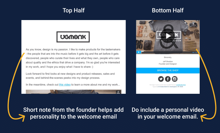
As you have seen from the brands mentioned above, they don’t have a video in their welcome emails.
Besides the video, UGmonk welcomes new subscribers with a short note from the founder, Jeff Sheldon –that also helped in adding the personality to the email.
The note pinpoints the specific target audience that will benefit from the UGMonk products:
“I like to make products for people that are into music before it gets big and the art before it gets discovered, people who curate their lives and what they own, people who care about quality the ethics that drive a company.”
In the video, Jeff shares an inspiring narrative that dives deep into the details, values, and reasons for starting a design brand. Prospects who resonate with Jeff and the story behind UGmonk are more likely going to hire his services.
Do: Allow visitors to personalize the content to meet their objectives
Example from Michaels’ welcome email.
Michaels is an online retail shop that specializes in arts and crafts, and home decor items.
This is the welcome email they send:
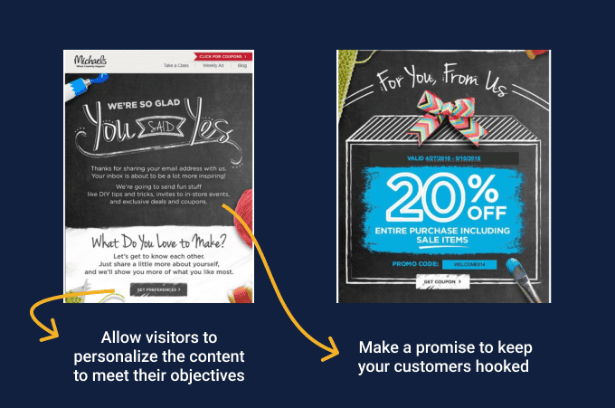
I like the creativity in Michaels’ welcome email presentation. As you can see from the image above, it is presented like an arts and crafts project as a way of mirroring what the brand is about.
Before anything else, the first section of this email is a promise from the brand to the new subscribers: “We’re going to send fun stuff like DIY tips and tricks, invites to in-store events, and exclusive deals and coupons.”
This keeps customers hooked as they will be expecting to receive goodies from this brand.
This email encourages new subscribers to take the next step in the customer journey by allowing them to customize their preferences. They use a CTA button to do so.
But Michaels doesn’t stop there. They make the customer’s life easy, they offer a 20% sitewide discount.
Do: Guard your prospects all the way down the funnel
BirchBox is a New York City-based online monthly subscription service that sends its subscribers a box of four to five selected samples of makeup, or other beauty-related products.
Their welcome email looks like this:
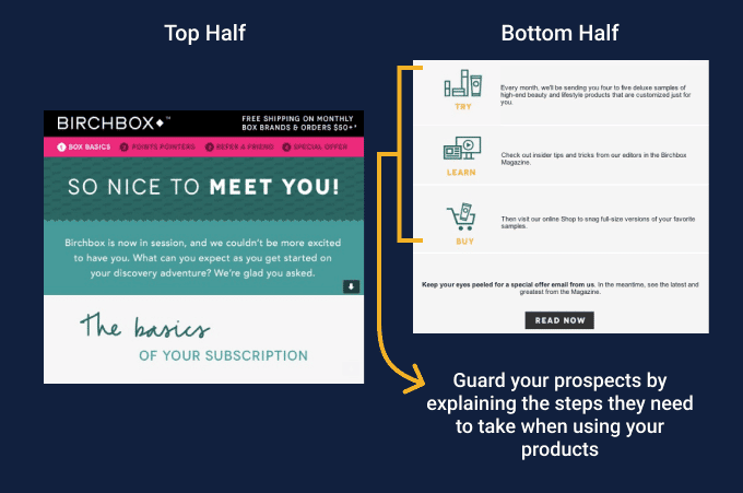
This one caught my attention because they’ve used a mix of casual checkups to drive the job of the email home.
Looking at Birchbox’s welcome email, I was convinced that prospects must have hired it to be a guardian in the buyer’s journey.
This is why Birchbox’s email lays out the three steps that help new subscribers to:
- Test or try products,
- Learn about the latest grooming tips
- And how they can purchase items suited to them.
In three simple steps, BirchBox mapped out their customer journey and they clearly state that the best way to make a quality purchase is first to try, then learn, and then make a purchase decision. And they provide the channels for both testing and research through deluxe samples and BirchBox magazine.
Do: Address the customers’ anxiety or habits of the present moment
Welcome email example from Grammarly.
Here is how Grammarly’s welcome email looks like:
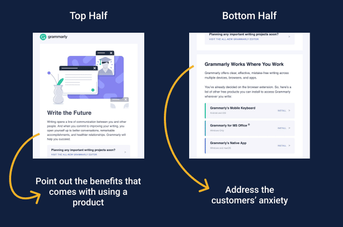
As a writing assistant, it’s easy to tell that people hire Grammarly to help them write better.
In the first paragraph of their welcome email, Grammarly persuades its new prospects to use this tool by pointing out the benefits of improving their writing skills. Which are: “you open yourself up to better conversations, remarkable accomplishments, and healthier relationships.”
When a potential customer lands on your site or receives your welcome email, they have got two forces – anxieties or habits – that are pulling them away from the conversion path. These two forces make a customer think that your product might not help them get a job done. If not addressed in your welcome email, they will drive away first-time customers.
This brings me to what I like the most about Grammarly’s welcome email. It addresses the anxiety of its first-time customers by ensuring them that: ‘Grammarly works where you work.’ Prospects don’t have to be skeptical about whether the tool works in a certain field or not.
This welcome email also goes on to show prospects a list of devices – Android & iOS, Windows, macOS – where they can use Grammarly. They also take the persuasion to another level by including the install button to get users started as soon as possible.
Conclusion
You see, welcome emails are easy to set up, and really it shouldn’t be something difficult to do. With stellar copywriting and branding, you can get prospects hooked to your site by using a welcome email. Learn from the examples above, and don’t forget to use the #JTBD framework in your research because it informs the copy of your emails.
Here is a summary of the welcome emails dos and don’ts based on the #JTBD framework:
- Do: talk about your mission as it will resonate with your visitor.
- Don’t: Create a cookie-cutter welcome email that doesn’t inspire prospects to make a purchase.
- Don’t: Emphasize features over the emotional and social motivations.
- Don’t: Drive your new subscribers away from your site.
- Don’t: Make it just about offers and incentives.
- Do: Include a personal video in your welcome email.
- Do: Allow visitors to personalize the content to meet their objectives.
- Do: Guard your prospects all the way down the funnel.
- Do: Address the customers’ anxiety or habits of the present moment.

