Imagine you have done all the conversion rate optimization work and now you live in a world of perfect landing pages. All you have to do is get visitors to click on your link and ~ poof ~ once they see your landing page, they all convert.
It’s a dreamland scenario for conversion optimizers, but it’s not as far-fetched as it sounds.
For an extreme example, if you gave away a Ferrari to everyone who took your call-to-action, you’d likely get a 100% conversion rate – though you’d be in dreamland for entirely different reasons.
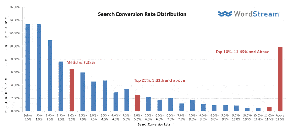
Back to reality, depending on your sources, industry sector, etc., average landing page conversion rates hover around 2.5% to 5%. According to searchengineland.com, the landing pages in the top 10% of conversion rates convert at 11.45% or higher. The highest converting landing pages have rates of 30% or more.
So, if the Ferrari trick gets you 100% conversions, but is entirely unrealistic, and realistic rates are at 5%, the problem of improving your landing page conversion rates is relatively simple.
Find out what prevents visitors from taking your call-to-action at the same rate as they take the Ferrari CTA. (OK, I know this sounds far-fetched, but bear with me, it’s worth it.)
What Stops Visitors from Converting on Your Landing Page?
Looking at a 5% conversion rate from another point of view: 95% of visitors do not convert (this is your ‘unconversion’ rate). That extreme variation in rates changes the problem you face in designing for higher rates.
Here’s a simple example of why the problem changes: If you wanted your sports car to have a top speed of 100 mph, and it already topped out at 90 mph, the question you must answer is: “how do I make the car go faster?’ Conversely, if your sports car could only reach 5 mph, the question you need to answer is: “why is it going so slowly?”
Landing pages are the sports cars of the web. They are finely tuned to get higher conversion rates. But they only get 5% of visitors to convert. To design a page for higher conversions, we need to find out why the page is so ‘slow’.
In Other Words: Focus More on Why Visitors Don’t Convert
If this sounds like simple semantics, think of it another way. Among the typical tips you’ll find online to improve conversion rates, one of the more common is to test the color of your CTA button to see which color converts best.
In one Hubspot test, a red CTA button outperformed a green button. The increase in clicks on the red button was an impressive 21%.
But let’s look at it from the other point of view. A 21% increase in a 5% conversion rate is 1%. If your ‘unconversion’ rate is 95%, the decrease in the unconversion rate is only 1.05%. Suddenly, looked at another way, the 21% increase is not so impressive.
That 21% improvement in conversion rates barely scratches your unconversion rate problem.
If you paid more attention to decreasing that massive unconversion rate, instead of the increasing the relatively tiny conversion rate, it can have a bigger impact on your bottom line. A 21% decrease in your unconversion rate translates into a 500% increase in your conversion rate.
Discovering Why Visitors Don’t Convert
The Ferrari example produces a 100% conversion rate because the sheer enormity of the benefit outweighs all the obstacles that lie between your visitors and their conversion.
The more of those obstacles your landing page eliminates, or at least diminishes, the better its conversion rates will be.
The particular reasons people convert on your landing page are as varied as the people who land there. But, if you want to design a higher-converting landing page, consider the following before you begin:
- Relevancy to a Need: Your potential customers search online because they have a perceived need or want that will be filled by either buying a product or service, or finding appropriate information. That need is foremost in their mind as they search the web. If the offer on your landing page happens to perfectly fit that need, you have a high chance of converting the visitor.Regardless of your ad copy or whatever other reason visitors thought your landing page might solve a need, if it is not quickly apparent that it will do so, they will leave.
- Trust & Confidence: Visitors, particularly first-timers, don’t know your business; don’t know if it’s legitimate; don’t know if you’ll deliver on your promise. In other words, they don’t have a lot of trust in your company and your offer, and they don’t have a lot of confidence that you can actually solve their need. Without a certain amount of trust and confidence, conversion rates will be low.
- Fears, Uncertainties & Doubts: Similar to trust and confidence, but on a more granular level, every visitor to your site has a number of fears, uncertainties and doubts. Even if your offer seems relevant and they have confidence in your ability to deliver the benefits, they may be fearful that their information will be misused, they may not be certain of their need and they might doubt that your solution will actually help.
In the Ferrari scenario, relevancy is eliminated because, even if they don’t want a Ferrari, they know it has a high monetary value for anyone. Similarly, any issues over trust, confidence, fears, uncertainties and doubts are dashed by the size of the benefit they will receive.
How to Put it All Into Action
As we have said many times in this blog, something that improves conversion rates on one landing page may not have the same effect on a different landing page. But if you want to address the obstacles listed above that stand between you and a converted customer, you need to consider the following elements in the design of your page.
- Headlines & Sub-Headlines: After they land, you have mere fractions of a second to prove the relevancy of your offer to visitors’ needs. The more you do so in your headline, the more likely it is that the visitor will stay long enough to move onto other elements of your page.
- Image or Video: Even if your headline gets them to stay, visitors are still full of fears, uncertainties and doubts about your offer. That makes them skittish and ready to leave. A picture is worth a thousand words toward easing their concerns – and a video runs at 30 pictures per second.
- Trust Icons & Elements: Your visitor has trust and confidence issues because she doesn’t know you. By using symbols that are familiar to her, like a Better Business Bureau logo, or instilling trust through customer reviews, testimonials and social proof, you can quickly reverse the concerns. A clearly identified privacy statement will also help ease some of their fears.
- Call-To-Action Button: Yes, color is important, but its placement, at a point where they realize all the obstacles to conversion have disappeared, is at least as important.
- Benefits First, Then Features: Regardless of the obstacle, the more benefits customers believe they will get from your offer the more likely they are to convert. Be sure to first tell them about how their needs will be solved, then about the features that will solve them.
So designing your landing page for higher conversions comes down to two choices: start thinking about the points above, or start negotiating a bulk discount from Ferrari.


