It’s frustrating when your add-to-cart rate doesn’t translate into completed purchases, leaving you wondering about missed opportunities and potential revenue. It’s even worse when customers leave without even adding anything to their cart in the first place.
But what’s stopping them from adding anything to their carts? Maybe they’re hesitating due to poor site layout? Or do they find your products too expensive? Or is it the navigation that’s deterring them from doing so?
In this article, we’ll discover all the factors affecting your add-to-cart rate and how to optimize it. Before that, let’s talk about a good add-to-cart and how to calculate it.
Understanding Add-to-Cart Rate
The Add-to-Cart Rate is the percentage of visitors who add an item to their cart from an online store. It’s important for retailers to understand this metric because it helps them determine whether or not they’re doing a good job of converting customers. The higher the Add-to-Cart Rate, the better your conversion rate will be.
To calculate the add-to-cart rate, divide the number of sessions where an item was added to the cart through the cart button (not taking into account abandoned carts) by the total number of website sessions.
The formula for add-to-cart rate is:
Add-to-Cart Rate = (Number of Items Added to Cart / Number of Sessions) * 100
For instance, if your ecommerce site had 500 sessions and 75 items were added to carts during that time, the calculation would be:
Add-to-Cart Rate = (75 / 500) * 100 = 15%
Now the question what’s a good add-to-cart rate that you should aim for?
A good add-to-cart rate in ecommerce can vary widely based on industry, product type, and user behavior. For example, regular consumer goods products tend to have a higher rate than relatively expensive luxury goods.
Overall, add-to-cart rates are around 9-18% worldwide. If you look at the US alone, the average add-to-cart rate is about 10%.
Why should you care about the add-to-cart rate?
The answer is simple: it’s an indicator of how well your website is converting visitors into customers. If people add items to their carts but then abandon them before checking out, you’ll have fewer sales than if they were buying everything they added.
Factors Affecting Add-to-Cart Rate
There are a number of factors that can influence your add-to-cart rate. Some of these are related to the products themselves, while others are related to the site or shopping experience.
Here are some of the common factors:
Product Type
What type of product are you selling? Is it a physical or digital product, and how high priced is it?
The more expensive the product, the less likely customers will be willing to pay for it without knowing more information about it first. This means that they may wait to add an item to their cart.
For example, someone may not buy a $1500 laptop without comparing it with other laptops in the same price range. However, if you sell children’s toys, customers may be more likely to purchase them immediately because they’re relatively inexpensive.
Industry Benchmarks
The add-to-cart rate varies by industry. Different benchmarks for different industries make benchmarking add-to-cart rates against industry averages crucial.
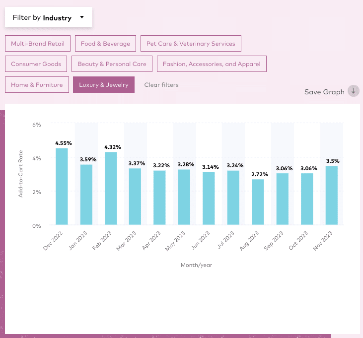
For example, a study found that the Food & Beverage sector has the highest add-to-cart rates, at 13.65%, while the Luxury & Jewelry industry has the lowest, at 3.42%.

(Source)
Pricing Strategy and Discounts
Pricing plays a crucial role in add-to-cart and conversion rates because it determines whether people will buy from your store. If you don’t have a clear pricing strategy, it will be hard for you to attract customers and increase the add-to-cart rate.
In addition to pricing strategy, discounts are another factor affecting your add-to-cart rate. Discounts can be a great way to get more people buying from you but don’t go overboard with them.
Too many discounted items on your site at once could negatively affect how customers see your brand and harm SEO rankings (if Google thinks there are too many duplicate pages).
User Experience and Website Design
User experience and website design are two major factors that can influence the add-to-cart rate of an online store.
A good user experience and website design can make it easy for visitors to browse, compare, and select products and proceed to checkout.
On the other hand, poor user experience and website design will cause confusion and deter them from adding a product to their cart. They’ll likely leave before even exploring your products.
Here are some aspects of user experience and website design that can affect the add-to-cart rate:
- Clear and obvious call-to-action buttons: CTA buttons (e.g., “Buy Now” or “Add to Cart”) should be big, bold, and easy to notice. A clear and obvious CTA can encourage visitors to take action and increase the add-to-cart rate.
- Complete and compelling product details: Product descriptions should include everything necessary for the optimum buying experience, including key features, benefits, specifications, images, videos, and even reviews. A higher-quality product page directly correlates with an increased add-to-cart rate.
- Responsive and fast-loading website: A responsive website can adapt to different screen sizes and devices, while a fast-loading website reduces the waiting time. This naturally leads to better retention and add-to-cart rates.
- Simple and intuitive navigation: Visitors shouldn’t have to go out of their way to find what they’re looking for on your website. Make sure you keep your navigation simple and intuitive. It can also provide suggestions, recommendations, and filters to help visitors narrow down their choices and discover new products.
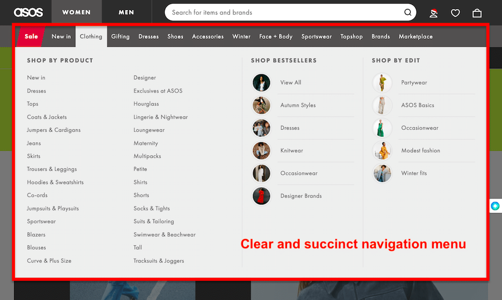
Take inspiration from ASOS, a renowned online fashion retailer – known for its user-friendly website design and exceptional user experience.
First and foremost, ASOS employs a clean and intuitive interface, making it easy for users to browse through various categories filter options and explore products effortlessly.

Next, if you head to their product pages, you’ll notice high-quality images and multiple views of products.
ASOS’s website is also optimized for mobile devices, offering a seamless shopping experience across different screen sizes.
With a well-designed UI and UX, you’ll most likely see a jump in your add-to-cart rates, ultimately leading to higher conversion rates.
Strategies to Improve Add-to-Cart Rate
Here’s a list of tried and tested strategies to optimize your add-to-cart rates:
Optimizing Product Pages
We already discussed how optimizing your site’s user experience and design is an integral factor that contributes to a good add-to-cart rate.
The product page is one of the most important parts of your site’s design. It’s where customers browse, search, and ultimately buy products.
Optimizing your product pages can result in higher overall add-to-cart rates, but it also has other benefits, including increasing customer satisfaction and reducing returns.
You can use several key strategies to optimize your product pages for better add-to-cart rates.
These strategies include:
- Make sure your product page is easy to find and navigate through.
- Use a clear and attractive layout for your products on the page.
- Use high-quality images that show off your products in their best light.
- Use bullet points to describe the key features of each product, but don’t go overboard with text – remember that people want to see the product, not read about it!
- Use social proof to encourage visitors to buy by showing how many other people have already purchased this item (social proof) or how many people have viewed it (visitor count).
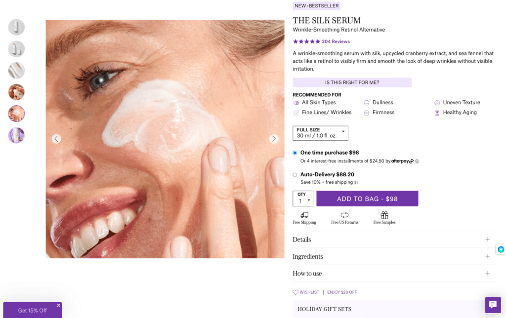
Tatcha, a skincare brand, does it well when it comes to its product pages.
To begin with, their product pages have a compelling and informative experience for users exploring their skincare products. You’ll find detailed information about ingredients, benefits, and usage instructions.

Additionally, they showcase testimonials and reviews, allowing customers to see how the product worked out for other customers.
Another thing that makes Tatcha’s product pages special is how naturally they incorporate the personalized recommendation feature, guiding users to products that suit their specific skin concerns.
This personalized approach enhances user engagement and confidence, making customers more likely to add Tatcha products to their carts.
Streamlining Checkout Process
A cluttered checkout process is one of the top reasons why customers abandon their carts. So, if you want to increase your Add-to-Cart rate, it’s time to streamline your checkout process.
Optimizing your custom fields is central to this.
If a customer has to fill out too many fields during registration or checkout, they’re likely to give up on the process altogether or abandon their purchase if they don’t have enough information readily available.
Custom fields are great for collecting information like contact details or shipping address details – but using them for unnecessary fields (like gender) could backfire on you.
Here are some more tips to streamline your checkout process for a better add-to-cart rate:
- Use one-page checkout
- Show product recommendations during checkout
- Make it easy for customers to change their minds at any point during checkout.
- Ensure that all form data is validated before submission, with no errors displayed to shoppers unless they must fix them before proceeding.
Implementing A/B Testing for Enhancements
One very effective way to improve your add-to-cart rate is through A/B testing, which allows companies to test different versions of their website on a small subset of their traffic so they can see what works best.
Here’s the step-by-step approach to A/B testing you can use to increase your add-to-cart rate:
- Identifying Elements: Select specific elements to test, including CTAs, product descriptions, images, layout, or even pricing strategies.
- Creating Variations: Develop two versions (A and B) of the chosen element. For instance, version A might have a red CTA button, while version B has a green one.
- Testing Methodology: Show the versions randomly to visitors (50% to version A, 50% to version B) to gather data on their performance.
- Data Collection and Analysis: Collect and analyze metrics like add-to-cart rates, click-through rates, and conversions to determine which version performs better.
- Implementing Changes: Implement the better-performing version based on the results to improve your add-to-cart rate.
Pro Tip: Use A/B testing platforms like FigPii for your testing process, eliminating the need for manual coding and automating the entire testing cycle. These platforms offer user-friendly interfaces where you can create and compare variations of elements, set testing parameters, and track performance metrics—all in one place.
Utilizing Behavioral Analytics
Behavioral analytics is a way to analyze customer behavior based on their activity on your site. Behavioral analytics uses the data from your customer’s actions on your website to understand better how they use it and what they seek.
It helps you improve your add-to-cart and conversion rates by making changes to your site based on the information gathered from behavioral data.
Here’s how you can identify and utilize behavior analytics:
- User Journey Analysis: Use behavioral analytics to map user journeys on your site. Identify drop-off points or areas where users hesitate to add items. Heat mapping and session recording tools like FigPii can reveal these pain points.
- Segmentation for Targeted Changes: Analyze behavioral data to segment users based on their interactions. Tailor A/B tests to offer personalized experiences for different user segments and observe their impact on add-to-cart rates.
- Real-Time Adaptation: Finally, adjust elements on your site based on user behavior, optimizing add-to-cart experiences as users engage.
Mastering the Path to Conversion: Unlocking Your Add-to-Cart Rate Potential!
This article discussed everything you need to know about the add-to-cart rate – from its significance to exploring the factors influencing this metric.
We further talked about the strategies that can help you improve the elusive add-to-cart rate, including optimizing product pages, streamlining checkout processes, leveraging A/B testing, and utilizing behavioral analytics.
Remember, it’s not merely about enticing customers to add items to their carts; it’s about crafting an engaging buyer journey and optimum user experience.


